 Previous Page Next Page
You can insert components into a web report via the Components panel on the left of the Web Report Studio window.
The following table lists the report areas that are valid targets for the various components:
Report Layout Area |
||||||||||||
|---|---|---|---|---|---|---|---|---|---|---|---|---|
| Component | Page Header/Footer | Tabular Cell | Table Cell | KPI | Banded Panel | |||||||
| Chart | Y | Y | N | N | Y | |||||||
| Crosstab | Y | Y | N | N | Y | |||||||
| Table | Y | Y | N | N | Y | |||||||
| Banded Object | Y | Y | N | N | N | |||||||
| KPI | Y | Y | N | N | N | |||||||
| Label | Y | Y | Y | Y | Y | |||||||
| Image | Y | Y | N | Y | Y | |||||||
| Multimedia object | Y | Y | N | N | Y | |||||||
| Web control | Y | Y | N | N | Y | |||||||
| Horizontal/Vertical Line | N | N | N | N | Y | |||||||
| Group object | Y | Y | Y | Y | Y | |||||||
| Detail object | Y | Y | Y | Y | Y | |||||||
| Aggregation object | N | N | Y | Y | Y | |||||||
| Formula | Y | Y | Y | Y | Y | |||||||
| Special field | Y | Y | Y | Y | Y | |||||||
The procedure for inserting tables in a web report varies with the way using which you use to access Web Report Studio: quick start way or traditional way.
To insert a table when Web Report Studio is in the quick start way:
 from the visualization toolbar or Table from the Components panel to the destination where you want to insert the table.
To insert a table when Web Report Studio is in the traditional way:
When Web Report Studio is in the traditional way, you can choose the table type as you want: Group Above, Group Left, Group Left Above or Summary Table.
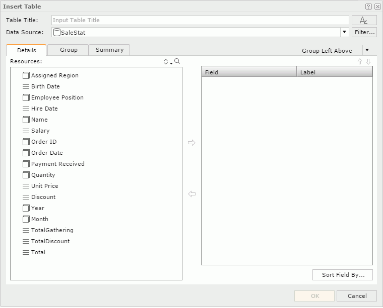
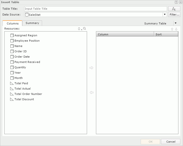
from the visualization toolbar or Table from the Components panel to the destination where you want to insert the table. The Insert Table dialog appears.
 to set the font properties for the title.
 When the table is to be inserted into any of the following panels in a banded object: banded header panel, banded footer panel, group header panel and group footer panel, it by default inherits data from the business view used by the parent banded object (<Inherit from the Parent> is selected in the Data Source drop-down list by default). You can select another business view to create the table if you want.
 or group objects
  from the Resources box to be displayed as detail fields in the table. To adjust the display order of the objects, select one and click
  or
or  . By default the display names of the added objects will be used to label the corresponding detail columns; to edit the label text for a detail column, click in the Label text box and enter a new one; if you want to automatically map the label text to the dynamic display name of the object, check the Auto Map Field Name checkbox beside the text box.
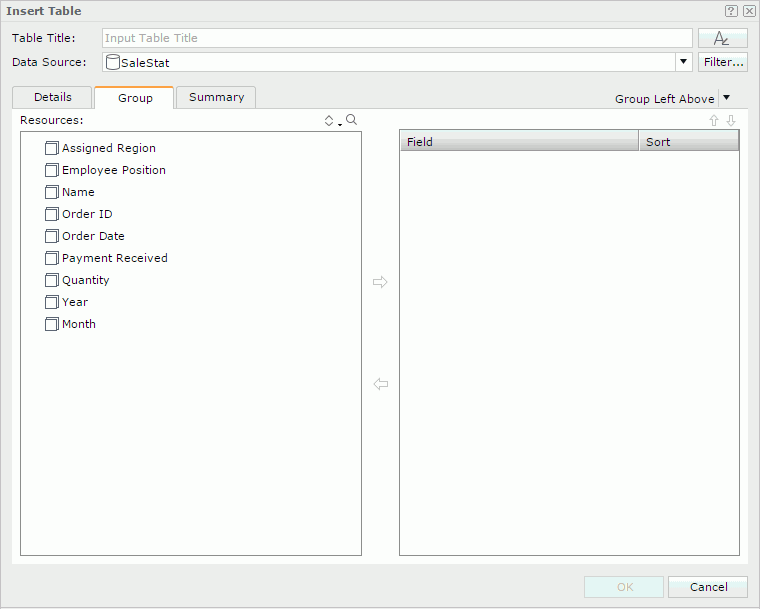
 to add it to the right box as the sort-by field. or to adjust the order of the sort-by fields, which will determines the sort priority of the fields. as the grouping criteria. Click or to adjust the group levels if needed. In the Sort column specify the sort manner of groups in each group level, which can be No Sort, Ascend, Descend, or Custom Sort.
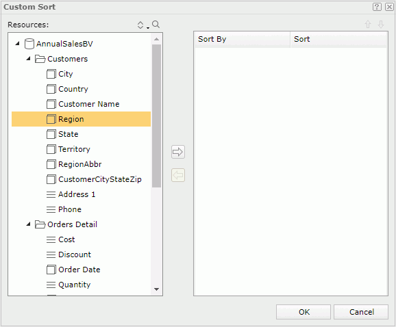
To customize the sort manner of a group:
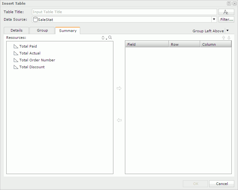
to add it to the right box as the sort-by field. or to adjust the order of the sort-by fields, which will determines the sort priority of the fields. to summarize data in the table as follows: in the right box, specify the group to which the aggregation will be applied, then select an aggregation object in the Resources box and add it to the right box. You can add several aggregations for any group level. Click or to adjust the order of the aggregations in the current group or move an aggregation to another group if needed. For the Group Left table, you can use the Row and Column columns to control the position of the aggregations in the table.
from the visualization toolbar or Table from the Components panel to the destination where you want to insert the table. The Insert Table dialog appears. to set the font properties for the title. When the table is to be inserted into any of the following panels in a banded object: banded header panel, banded footer panel, group header panel and group footer panel, it by default inherits data from the business view used by the parent banded object (<Inherit from the Parent> is selected in the Data Source drop-down list by default). You can select another business view to create the table if you want.
and aggregation objects in the specified business view from the Resources box to display in the table. Click or to adjust the display order of the added objects if needed. The order of the group objects determines the group levels in the table: the topmost group object the highest group level and the lowest group object the innermost group level. All the aggregations are parallel and calculated based on the lowest group. In the Sort column specify the sort manner of groups in each group level, which can be No Sort, Ascend, Descend, or Custom Sort.
 from the visualization toolbar to the destination where you want to insert the crosstab. The Insert Crosstab dialog appears.
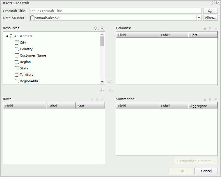
to set the font properties for the title. When the crosstab is to be inserted into any of the following panels in a banded object: banded header panel, banded footer panel, group header panel and group footer panel, it by default inherits data from the business view used by the parent banded object (<Inherit from the Parent> is selected in the Data Source drop-down list by default). You can select another business view to create the crosstab if you want.
and click or  to add it as a column or row group in the crosstab. In the Sort column, specify the sort manner of the group. or a detail object and click
  to add it to the Summaries box as an aggregate field to create aggregations in the crosstab. If a detail object is added, specify the aggregate function for it in the Aggregate column. If necessary, you can specify a comparison function for the aggregate field.
To define comparison function for an aggregate field:
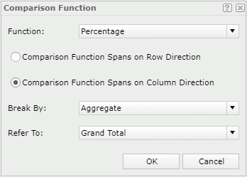
Items in the Break by drop-down list vary based on the position of the comparison function. It specifies the first parameter of the comparison function: the detail aggregation in the crosstab (Aggregate) or the subtotal of a specified row/column group.
Items in the Refer to drop-down list also vary according to what you have selected from the Break by drop-down list. It specifies the other parameter of the comparison function: the grand total or subtotal for an outer row/column group.
or ; to remove an unwanted field, select it and click  .
.Tip: When you create a crosstab with wizard, by default there will be no labels generated for its columns, rows and summaries (the Label columns in the Columns, Rows and Summaries boxes of the wizard are blank by default). You can make JReport automatically provide the labels which by default are the display names of the added objects by setting the profile options Add Labels for Crosstab Rows and Columns and Add Labels for Crosstab Summaries. You can also customize the profile option Display Crosstab Summaries Vertically to make the summaries in crosstabs displayed horizontally in Web Report Studio.
Normally, a chart displays values in a static way and you cannot change the values on it once it is created. However, JReport provides you with options to make the chart interactive and dynamic. For example, if your data source uses data that changes quickly over time such as stock market values, you can create a real time chart, so that the chart will update itself based on a defined interval by using the real time data from the data source. You can make a chart move at runtime based on the value changes of a motion field by creating a motion chart. In a motion chart, the chart is playable. You can start or stop the chart to play the dynamic trend of the motion field, control the moving speed of the chart, and if you create a bubble motion chart, you can even use a trail control to make the chart move showing a bubble or line trail.
In Web Report Studio, when you create a chart, you can choose to make it a common chart, an organization chart, a heat map, a real time chart, or a motion chart.
to set the font properties for the title. When the chart is to be inserted into any of the following panels in a banded object: banded header panel, banded footer panel, group header panel and group footer panel, it by default inherits data from the business view used by the parent banded object (<Inherit from the Parent> is selected in the Data Source drop-down list by default). You can select another business view to create the chart if you want.
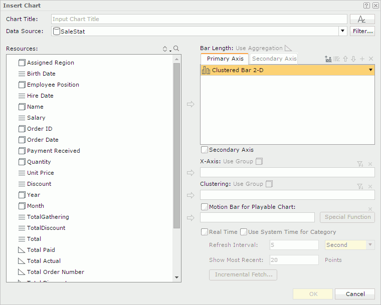
To create a combo chart, click  above the Primary Axis box and an additional chart type will be added. You can replace the additional chart type by selecting the required one from the chart type drop-down list. Repeat this to add more chart types. Check the Secondary Axis checkbox if you want to have the secondary axis (Y2) and define the chart types on the axis as required. To delete a type, select it and click .
, a numeric detail object , or an additional value  as the value of the type. You can add more than one value to a chart type. Each added chart type shall have at least one value.
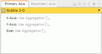
If you select the Bubble chart type, you need to specify the values for the bubble X axis and Y axis and the value to determine the size of the bubbles respectively. When a value is added for the bubble X axis, it will be displayed on the category axis instead of that specified for the category axis, while the value added to the category axis will still be included in data calculation.
To add an additional value to a chart type:
beside the value box. The Edit Additional Value dialog appears. To modify a constant/average value, select the value in the value box, then click  . In the Edit Additional Value dialog, edit the value as required.
or a detail object from the Resources box to display it on the category axis of the chart. Add a group object to display on the series axis. The box names of the two axes vary with different chart types, for example, they are X-Axis and Clustering for a clustered bar chart. above the axis box, then define the order and condition in the Category Options dialog or Series Options dialog.
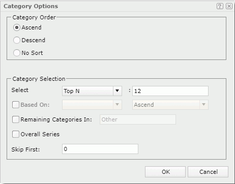
If Based On is unchecked, all category/series values or its first/last N values will be sorted in the order you specify in the Category Order/Series Order box of the dialog; if you check it, you can make the values sorted based on a field added to the value axis of the chart and select a sort order as you want. When Custom Sort is selected from the Based On drop-down list, you can customize based on which fields to sort the values and set the sort order for each sort-by field using the Custom Sort dialog.
To create an organization chart:
Organization chart, also referred to as org chart, is a one-root-node-tree-structure diagram showing the ownership or reporting to relations among the nodes which are mapped to a specific entity.
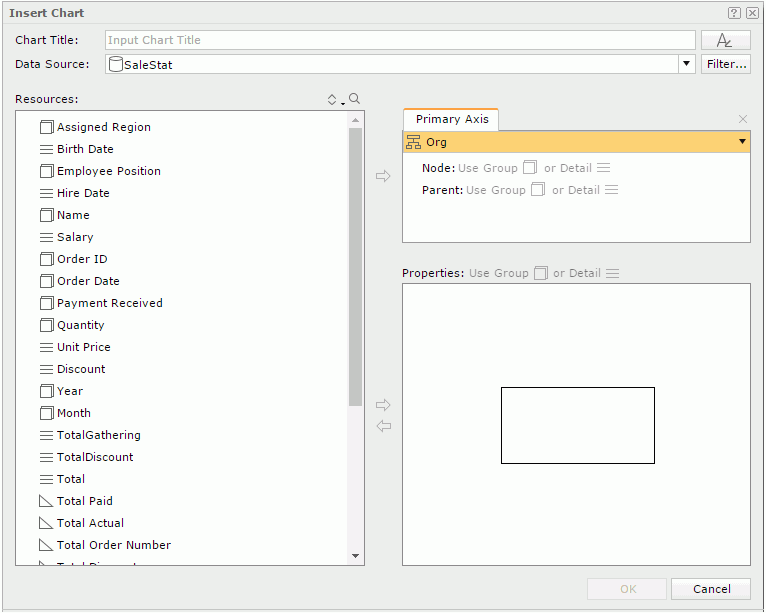
or a detail object from the Resources box and click . The values of the object will be displayed as the nodes in the org chart. to define the ownership or reporting to relationship among the node field values. The parent field should be of the same data type as the node field but different from the node field. The values of the parent field should be a subset of those of the node field. For example, if the node field is Employee ID, the parent field can be the one about IDs showing which employ ID reports to which employ ID. beside the Properties box. You can resize the node model and adjust the position and size of the added objects in the node model as required. To remove an unwanted object from the node model, select it and click  .
.A heat map displays values by colors and sizes in a matrix. It is composed of several rectangles that are grouped by group objects. Each rectangle represents a value of a group object or a combination of values of multiple group objects.
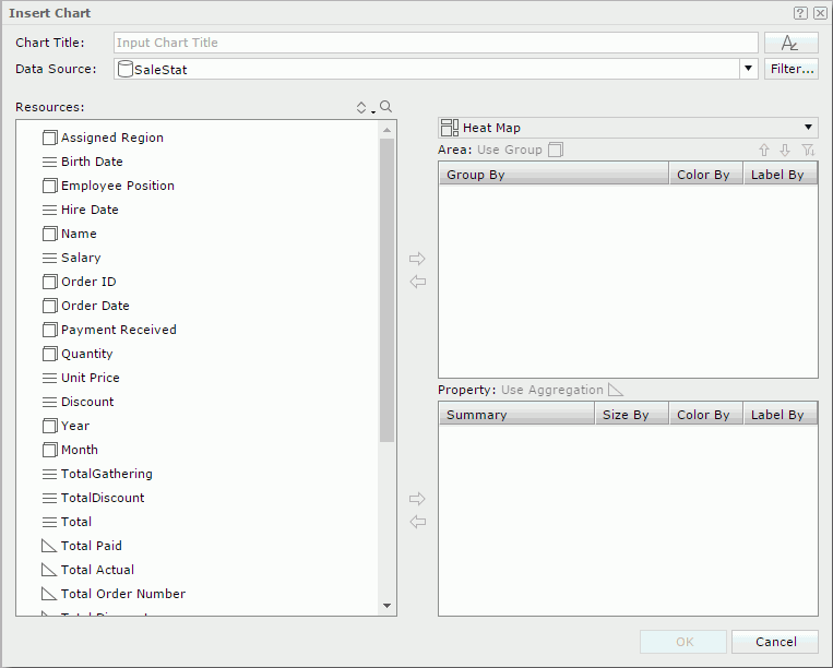
into the Area box to create groups in the heat map. You can use and to adjust the group levels. Each combination of the groups in all the group levels is represented by a rectangle in the heat map.
To remove a group, select it and click . above the Area box. In the Group Options dialog, specify the order and condition the same as you do for the category/series axis. into the Property box to define the properties of the rectangles.Real time chart is supported on single bar, bench, line, and area chart types.
or group objects of numeric type as the data of the type. to display on the category axis. If you want to customize the sort order and define Select N condition for values on the category axis, click above the category box, then define the order and condition in the Category Options dialog.Once a unique key is defined, each time when the real time chart automatically updates itself, duplicated data records will be filtered out based on the unique key. For instance, if you add Country and Product ID as the unique key of a real time chart, when a record with the product ID 1 in USA has already been loaded into the chart, no more records of this product ID in USA will be added to the real time chart because they have the same unique key value.
Motion chart is supported on single chart of bar, bench and bubble types.
or additional values as the data of the type.
If you select the Bubble chart type, you need to specify the values for the bubble X axis and Y axis, as well as the value to determine the size of the bubbles respectively. When a value is added for the bubble X axis, it will be displayed on the category axis instead of that specified for the category axis, while the value added to the category axis will still be included in data calculation.
from the Resources box to display its values on the category or series axis of the chart. The box names of the two axes vary with different chart types, for example, they are X-Axis and Clustering for a clustered bar chart. above the category or series box, then define the order and condition in the Category/Series Options dialog.When a motion chart is created, you can use the motion control section to make the chart move. Click the play button and the chart will show its dynamic trend based on the value change of the motion field which is bound in the motion bar. To stop it, click the button again. You can also control its moving speed by dragging the slider between Slow and Fast on the speed control. For a bubble chart, you can control whether the chart will be moving in bubble or line trail.
 from the visualization toolbar to the destination where you want to insert the banded object. The Insert Banded Object dialog appears.
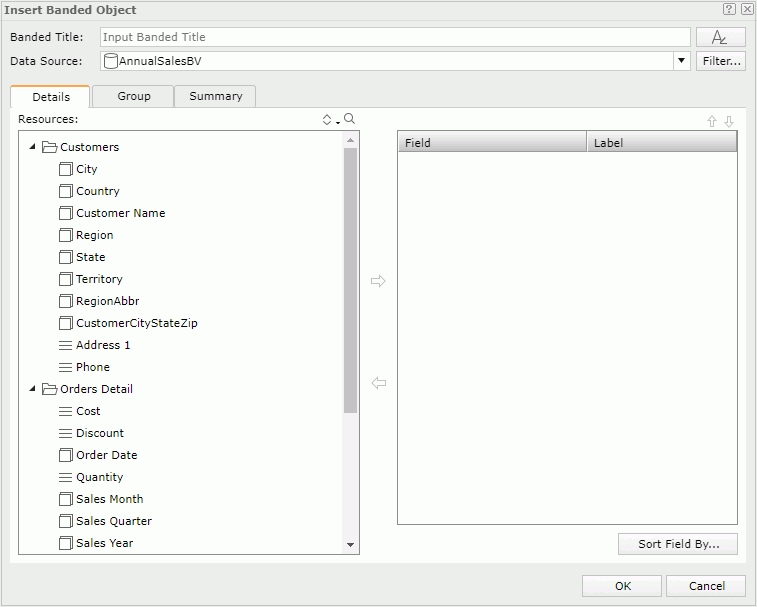
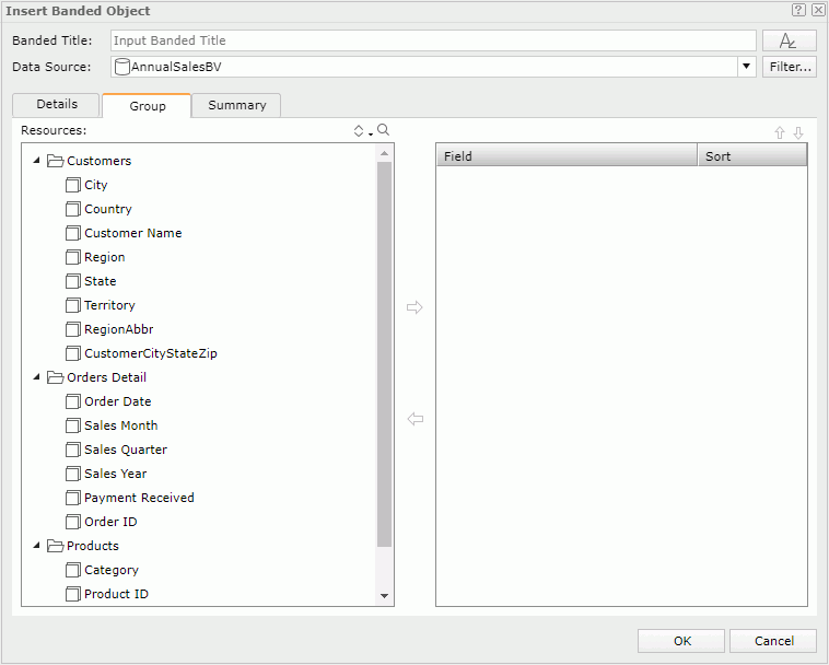
to set the font properties for the title. or group objects from the Resources box to be displayed as detail fields in the banded object. To adjust the display order of the objects, select one and click or . By default the display names of the added objects will be used to label the corresponding detail columns; to edit the label text for a detail column, click in the Label text box and enter a new one; if you want to automatically map the label text to the dynamic display name of the object, check the Auto Map Field Name checkbox beside the text box. as the grouping criteria. Click or to adjust the group levels if needed. In the Sort column specify the sort manner of groups in each group level, which can be No Sort, Ascend, Descend, or Custom Sort.
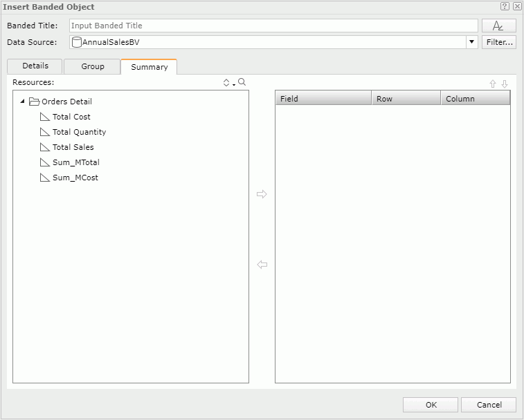
to summarize data in the banded object as follows: in the right box, specify the group to which the aggregation will be applied, then select an aggregation object in the Resources box and add it to the right box. You can add several aggregations for any group level. Click or to adjust the order of the aggregations in the current group or move an aggregation to another group if needed.
 from the visualization toolbar to the destination where you want to insert the KPI.
or a dynamic formula from the Resources panel as the KPI value. The name label of the object is added in the KPI at the same time. Edit the label text if needed. to set the font properties for the title. 
You can insert the following web controls into a web report: parameter control, parameter form control, filter control, and navigation control. For details, see Using Web Controls.
To insert a special field into a web report, just drag the special field from the Components panel to the destination in the report.
A horizontal/vertical line can only be inserted into a banded object in a web report. To do this, just drag Horizontal Line or Vertical Line from the Components panel to the destination in the banded object.