 Previous Page Next Page
This dialog appears when you drag Filter Control from Toolbox in the Resources panel to the dashboard body. It helps you to insert a filter control into the dashboard body to filter component data.
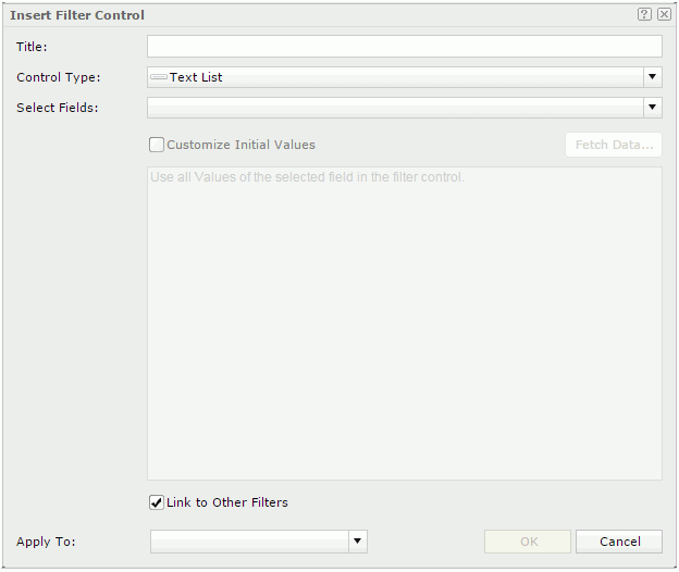
Title
Specifies the title of the filter control.
Control Type
Specifies the type of the filter control: Text List, Single Value Slider or Range Slider.
Select Fields
Specifies the fields to bind to the filter control. All the selected fields should be of the same data type.
Customize Initial Values
By default all values of the selected fields will be used in the filter control. You can check the option to customize the value list.
The customization UI is different according to control types:
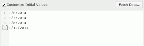
The text box is an editable multi-row plain text box. It supports general text editing operations including copy, paste, cut, backspace, delete and etc. The Enter key on the keyboard is used to start a new row. Each row is a value of the user defined value list.
When Customize Initial Values is selected but the text box is empty, all values of the selected fields will be used in the filter control.

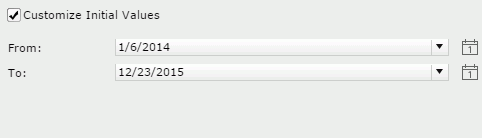 to specify a value using the calendar. to specify a value using the calendar.
Link to Other Filters
Specifies whether the filter control can be affected by other filter controls that apply to the same data components as the filter control.
Special Function
Specifies a special function for the selected fields if they are of the Date/Time type. Available only to the slider control types.
Apply To
Specifies the data components from the drop-down list to apply the filter control to. <All> means all data components involving the selected fields in the dashboard.
OK
Closes this dialog and inserts the filter control in the dashboard body.
Cancel
Cancels the insertion and closes this dialog.

Displays the help document about this feature.

Ignores the setting and closes this dialog.