 Previous Page Next Page
Filtering scenarios and filter logic
Link relationship between filter controls
Filter controls are used to filter one or more data components in a dashboard. They can filter based on the fields in the business views the data components are created from.
JDashboard supports three types of filter controls: Text List, Single Value Slider, and Range Slider.
The filters created via filter controls are also referred to as on-screen filters.
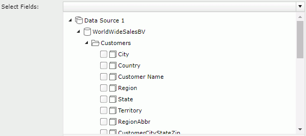
Filtering based on one field is a common usage. Bind a field to a filter control, and then based on the field to filter the data components created from the same business view as the field. Another special usage is to filter data components created using different business views. In this case you need to choose a common field all the business views contain and select the common field from all the business views to bind them to the filter control. The name of the fields do not need to be the same but the data returned needs to be similar.
After you select values in one or more filter controls in a dashboard, a filter condition based on the selected values of the specified fields will be applied to the designated data components in the dashboard, with each field affecting only the data components based on the same business view as the field. The value selection logic is as follows:
When you bind a filter control with multiple different fields in different data resources, such as Country, P_Country and S_Country, be sure the list of values in each field match so that when you select a value, it will match the appropriate country field in each data resource. That's because in cases like this JReport applies the logic OR for the values, that is Country=SelectedValue1 or P_Country=SelectedValue1 or S_Country=SelectedValue1. Therefore, when Country, P_Country and S_Country are used in different data components you will see the records correctly in each component. If you bind a filter control with multiple different fields in different business views which do not contain the same list of values such as Country, Region and Territory, after you select a value in the filter control, the result will have no matching records for two of the fields and therefore the data components using the same data resources as the two fields will become blank components.
By default, all the filter controls applied to the same data components in a dashboard are interlinked. The link relationship is reflected on the filter values dynamically: selecting a value in one filter control will result in that values which do not belong to the selected value, contain the selected value or relate to the selected value are grayed in all the other linked filter controls for distinguishing. For example, there is a filter control based on the field Country and another on City and they both are applied to the same table. When you select USA in the Country filter control, the values in the City filter control will change as follows: if the City filter control has a scrollbar, the cities belong to USA are displayed in the upper area of the filter control and the other cities are put in the lower area and grayed out; if it has no scrollbar, all the values remain their positions and the values not belonging to USA are grayed out. In both cases all the values are still selectable.
When using a filter control, you can determine whether or not to make the filter control apply the link relationship via the Link to Other Filters option.
Below is an example showing the logic of other linked filters:
When
Filter1 is applied to DC1, DC2, and DC3.
Filter2 is applied to DC1.
Filter3 is applied To DC2.
Filter4 is applied to DC2 and DC3.
The result:
For Filter1, other linked filters are Filter2, Filter3, and Filter4.
For Filter2, other linked filter is Filter1.
For Filter3, other linked filters are Filter1 and Filter4.
For Filter4, other linked filters are Filter1 and Filter3
 on the toolbar to display the Resources panel.
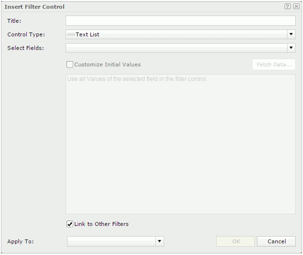
For a text list filter control, after the filter control is created the name of the first selected object will be displayed as the name of the filter control.
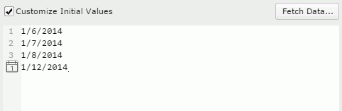
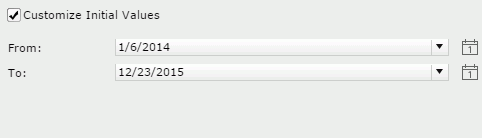
To enter a value, input it in one row, and then press the Enter key to start a new row. General text editing operations including copy, paste, cut, backspace, delete and so on are supported. You need to make sure of the accuracy of the formats and values. If the selected objects are of the Date/Time type, you can also click  to specify a date and time value from the calendar.
to specify a date and time value from the calendar.
| Special Function | Description |
|---|---|
| None | All the records that have the same field value will be displayed together as a group. |
| For each day | The records, of which the field values are in the same day, will be grouped together. |
| For each week | The records, of which the field values are in the same week, will be grouped together. |
| For each bi-week | The records, of which the field values are in the same bi-week, will be grouped together. |
| For each half month | The records, of which the field values are in the same half month, will be grouped together. |
| For each month | The records, of which the field values are in the same month, will be grouped together. |
| For each quarter | The records, of which the field values are in the same quarter, will be grouped together. |
| For each half year | The records, of which the field values are in the same half year, will be grouped together. |
| For each year | The records, of which the field values are in the same year, will be grouped together. |
By default, JReport applies the filter to all the data components created using the business views in which the selected objects are obtained. If you uncheck the data components which are based on the same business view as any selected objects, these objects will not be used in the filter and thus their values will not be listed in the filter control.
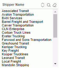
You can now select values from the filter control to filter the dashboard data. If the objects bound to the filter control have the same values, the values are distinctive in the filter control.
You can make use of the Ctrl or Shift key to select multiple values. If the values themselves have inter-relationship, after you make the selection, JReport will deal with the rest values to put the related ones on the top and gray the ones that have no relationship with the selected values. The grayed values are still selectable.
To easily locate the values you want in the filter control, click  on the name bar to sort the values in the ascending or descending order. You can also make use of the search toolbar to search for the desired values. To display the toolbar, click
  on the name bar. The button
  on the name bar is used to cancel the selection of values in the filter control. For detailed usage about the search toolbar, click here.
For the filter controls inserted in a dashboard, you can further edit them if needed. To edit a filter control, click  on the component title bar and select Edit Setting from the drop-down menu. In the Edit Filter Control dialog, edit the filter control according to your requirements.
Notes:
When the Use Default On-screen Filter Values feature is enabled for dashboards, each end user can save the values specified to the filter controls in a dashboard as the default values for the dashboard and for him. Next time when the user runs the dashboard, the saved values will be applied to the filter controls by default. The default values in filter controls work on a user-dashboard basis.
 on the toolbar, go to On-screen Filter Values and then select Save as Default. on the toolbar, go to On-screen Filter Values and then select Clear Default. on the toolbar, go to On-screen Filter Values and then select Restore to Default.