 Previous Page Next Page
This dialog appears when you double-click the legend of a chart in a report, or right-click it and select Format Legend from the shortcut menu. It helps you to format the legend of a chart.
The dialog contains the following tabs: Fill, Border, Placement, Font, Orientation, Format, Mark, Label and Behaviors (the Behaviors tab is available to charts in library components only).
OK
Applies the changes and closes the dialog.
Cancel
Does not retain any changes and closes the dialog.
Apply
Applies all changes and leaves the dialog open.
Help
Displays the help document about this feature.
Specifies the color and its transparency for the legend of the chart.
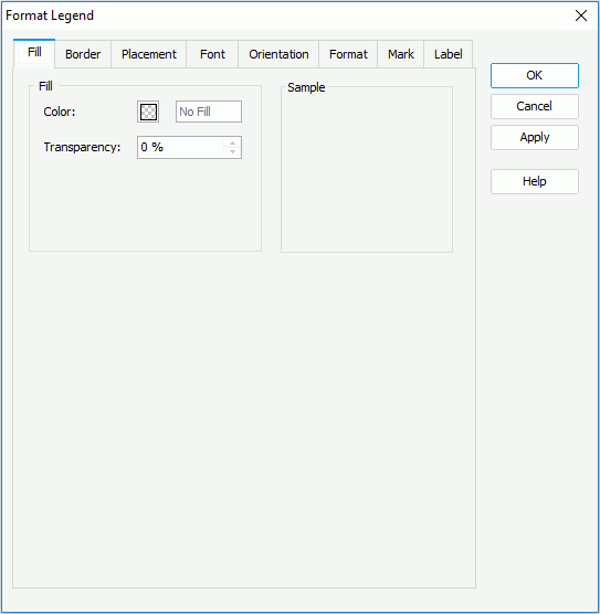
Color
Specifies the color to fill the legend. To edit the color, click the color image and select a color from the color palette or input the hexadecimal value (for example, 0xff0000) of a color directly in the text box.
Transparency
Specifies the transparency of the color.
Sample
Displays a preview sample of your selection.
Specifies the properties for border of the legend.
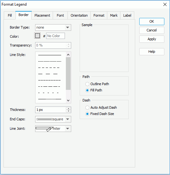
Border Style
Specifies the type for border of the legend.
Color
Specifies the color for border of the legend.
Line Style
Specifies the line style to apply to the border of the legend.
Thickness
Specifies the thickness of the border, in pixels.
Transparency
Specifies the transparency for the color of the border.
End Caps
Specifies the ending style of the border line.
Line Joint
Specifies the line joint style for the border line.
Path
Specifies the fill pattern of the border line.
Specifies the dash size of the border line.
Sample
Displays a preview sample of your selection.
Specifies the location of the legend object.
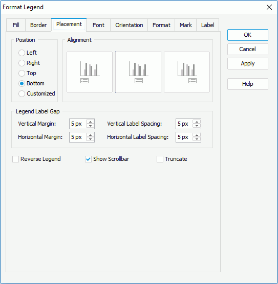
Position
Specifies the position of the legend to be left, right, top, bottom or customized by dragging on the chart manually. You can preview the samples when the position is not Customized.
Alignment
Specifies the alignment format for the legend.
Legend Label Gap
Specifies the minimum distance between the legend entry labels.
Reverse Legend
Specifies whether the legend entries will be re-arranged in a reverse order.
Show Scrollbar
Specifies whether to show a scrollbar on the legend to fully view the legend content when the content does not fit into the legend.
Truncate
Specifies whether to truncate the legend entry label text when the text overflow the labels.
Specifies the font format of text in the legend entry labels.
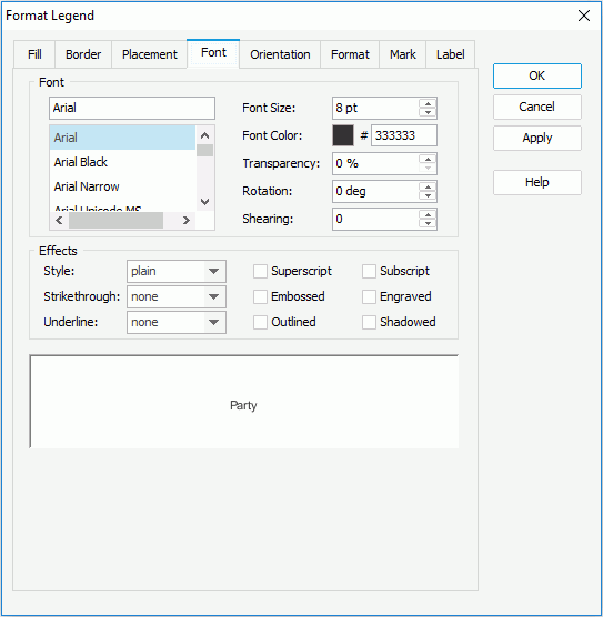
Font
Specifies the font format of text in the legend entry labels.
Effects
Specifies the special effects of text in the legend entry labels.
Note: Web Report Studio and JDashboard do not support underlining chart text so this property will be ignored when the chart runs in Web Report Studio or is used in a dashboard.
Sample
Displays the specified font and any text effects.
Specifies the alignment format of the legend entry labels.
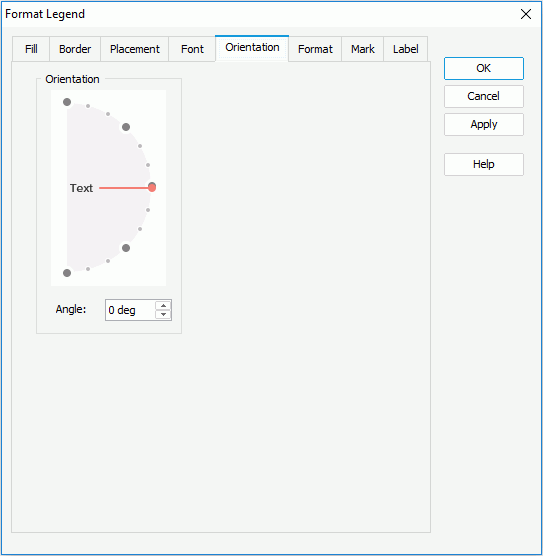
Orientation
Specifies the orientation of the legend entry labels.
Angle
Specifies the angel of the legend entry labels.
Specifies properties for the legend entry labels, which take effect only when the property Label Format Source of the chart legend is set to Legend Label Format in the Report Inspector.
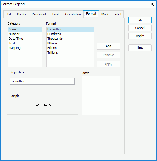
Category
Lists the category types. Select one to customize its format.
Format
Lists all the formats of the selected category. Select the required one and click Add to add it as the format of the specified category. You can add only one format for each category.
Properties
Specifies the properties for the format that you selected.
Stack
Lists all the formats that you selected from different categories.
Sample
Displays the effects of the selected format that has been added into the Stack list box.
Add
Adds a format to the Stack list box.
Remove
Removes a format from the Stack list box.
Apply
Applies the specified format in the Stack list box to the legend entry marks.
Specifies the format of the legend entry marks.
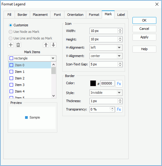
Customize
Specifies whether to customize the format of the legend entry marks.
Use Node as Mark
Specifies whether to apply the format of line nodes to the legend entry marks. If selected, the legend entry marks will automatically inherit the style and color of line nodes. Available to line charts only.
Use Line and Node as Mark
Specifies whether to apply the format of lines and line nodes to the legend entry marks. If checked, the legend entry marks will automatically inherit the style and color of lines and line nodes. Available to line charts only.
Mark Items
Specifies the style of the legend entry marks. Select the mark item from the box one by one and choose the style for each item from the drop-down list. Available only when Customize is checked.


Icon
Specifies the properties of the icons.
Border
Specifies the border properties of the icons. Available only when Customize is checked.

Preview
Displays the specified item and mark effects.
Specifies the text of the legend entry labels. This tab is available only when the legend entry labels show the values of the field displayed on the category or series axis of the chart.
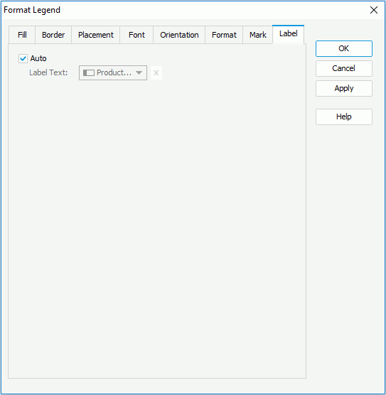
Auto
If checked, the legend entry labels display values of the category/series field. You can uncheck it to customize the label text.
 to input the desired label text manually.
Specifies web behaviors to the legend of the chart. This tab is only available to charts in library components.
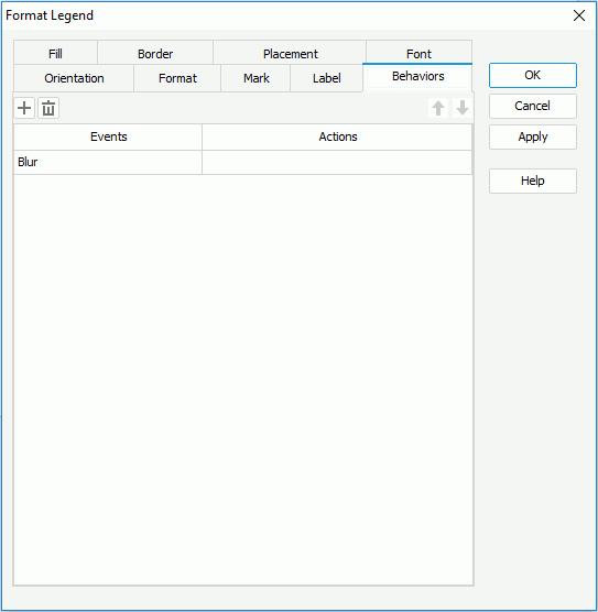
Adds a new web behavior line.
Removes the selected web behavior.
Moves the selected web behavior up a step.
Moves the selected web behavior down a step.
Events
Specifies the trigger event.
Actions
Specifies the action you want the event to trigger.
