 Previous Page Next Page
Using text fields in a library component
You can use the following basic web controls which are used as variables into the configuration panel of a library component: Text Field, Checkbox, List and Drop-down List, so as to filter or sort the records in the table, chart or crosstab of the library component or change the properties of an object in the library component at runtime.
 to the required destination.
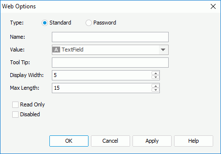
Standard means that the text field will be a normal text field. Password means that the text field will be a password box in which the typed characters will be displayed as asterisks.
To apply the Filter web action:
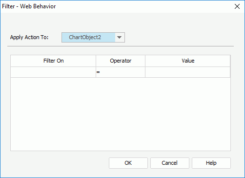
Then at runtime, when dashboard end users specify a value for the text field and click OK in the configuration panel, the records in the specified data component will be filtered.
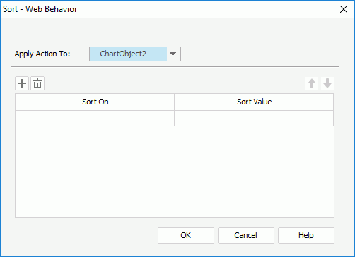
 to add a new sort condition.
To delete a sort condition, click  . To adjust the order of the sort conditions, click
  or
or  .
.
Then at runtime, when dashboard end users specify a value for the text field and click OK in the configuration panel, the records in the specified data component will be sorted.
To apply the Change Property web action:
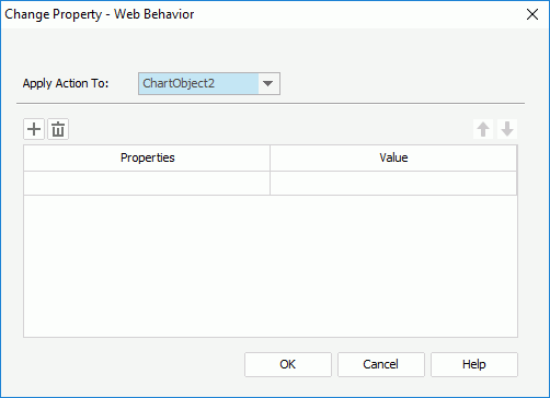
to add a new line to change a property.
To delete a property line, click . To adjust the order of the properties, click or .
Then at runtime, when dashboard end users specify a value for the text field and click OK in the configuration panel, the properties of the specified object in the library component will be changed.
Tip: The Change Property web action can also be applied on the following objects in the library component body: fields and labels in tables/crosstabs, some chart elements such as legend, chart axis and so on, markers and areas in geographic maps, labels, parameter controls and the Submit button of parameter form controls.
 to the required destination.
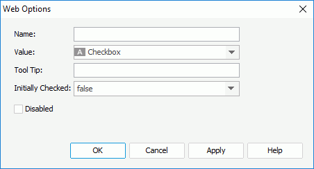
 /
/ to the required destination.
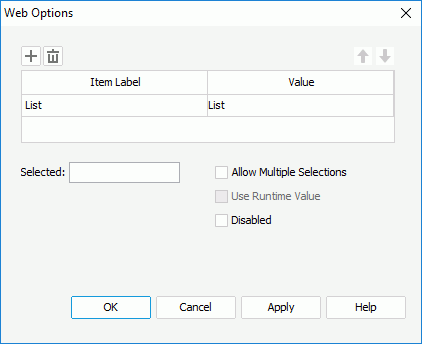
If you want to use a DBField/formula field/parameter field to control the value, click  in the Value column to insert one with the Insert Fields dialog, and then select the format for the inserted field from the drop-down list in the Item Label column. Check the All radio button in the Insert Field dialog if you want to add an All value to the list/drop-down list. Then when All is selected as value of the list/drop-down list at runtime, all filter actions defined on the list/drop-down list will not take effect, and if you applied some other web action that needs value from the list/drop-down list, a Null value will be returned.
Note: If you have specified a tooltip for a text field or checkbox, the tooltip will be displayed differently on different browsers: