 Previous Page Next Page
Labeling Time Series Data by Constant Interval
Time series data is data collected over time for a single or a group of variables. When using date series and time series values on the category (X) axis of a chart, it is often beneficial to see the chart with constant ranges rather than just what is in the data values. Missing values for weekends and holidays leaves gaps which distorts the chart and might lead to incorrect decisions.
The following example shows how to use a constant interval to label time series data on the category axis:
- Make sure SampleReports.cat is the currently open catalog file. If not click File > Open Catalog to open it from
<install_root>\Demo\Reports\SampleReports.
- Click File > New > Web Report to create a web report.
- Insert a chart in the web report as follows:
- Use WorldWideSalesBV in Data Source 1 of the catalog as the data source.
- Display in the Line 2-D chart type.
- Show Order Date on the category axis and Total Quantity on the value axis.
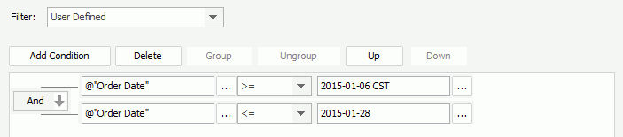
- Apply the following filter:
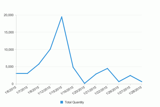
- Save the report and click the View tab to preview the chart. The chart appears as follows:
- Click the Design tab to return to the design mode.
- Right-click the chart and select Format Axes > Format Category (X) Axis from the shortcut menu. The Format Category (X) Axis dialog appears.
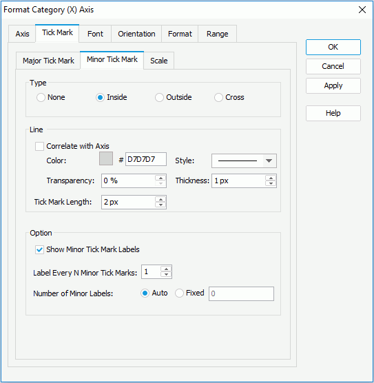
- In the Tick Mark tab of the dialog, click the Minor Tick Mark sub tab, check Inside in the Type box to show the minor tick marks inside the axis, and then check Show Minor Tick Mark Labels in the Option box to show the minor tick mark labels.
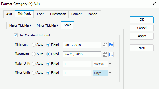
- Click the Scale sub tab, check the Use Constant Interval option, then set the Minimum, Maximum, Major Unit and Minor Unit options to Fixed. Specify the minimum value to Jan 1, 2015 and the maximum value to Jan 29, 2015. Set the Major Unit and Minor Unit values to 1 and select the unit as Weeks and Days respectively which stand for 1 week and 1 day.
When specifying the Minimum/Maximum value, you can also click  to select a date and time value from the calendar if the field on the category axis is of Date, DateTime or Time type, or click
  and select a formula to control the value. When a DBField is selected from the drop-down list, its first record in the database will be used as the value. If the selected formula references a parameter, you can dynamically specify the minimum/maximum value at runtime.
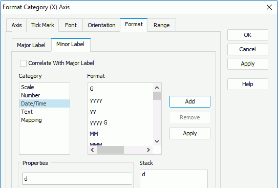
- In the Minor Label sub tab of the Format tab, select the format in the Stack box and click Remove to delete it. Select Date/Time from the Category box, input d in the Properties text box and click Add to add the format to the Stack box. Then click OK to apply the settings.
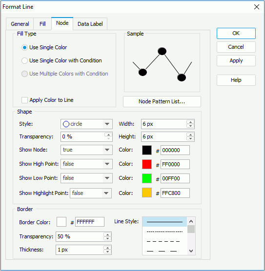
- Double-click the line to bring out the Format Line dialog. In the Node tab, select Use Single Color, then select true from the Show Node drop-down list to show nodes on the line, and specify the node color to #000000. Click OK to accept the settings.
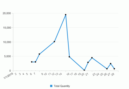
- Resize the chart and preview it again. The chart now shows as follows:
Previous Page Next Page