Previous Page Next Page
Creating a chart based on a business view
Creating a chart based on a query resource
Defining the data for an organization chart
With the chart wizard, it is easy to create charts in a report, however the wizard varies with the data resource type used for the chart: business view or query resource. In addition, based on different chart types some screens of the chart wizard display differently.
A web report and library component can only use business views. For a page report it can be created either based on query resources or business views, which is determined at the time when the page report is created by the Create Using Business View option. Once defined, all the data components in the page report can only be created on the specified data resource type.
The 3-D chart types are only supported in page reports that are created using query resources.
A chart can be inserted in the report areas listed in Component placement. When a chart is inserted into a banded object that is created using a query resource, you can use a data container link to define the relationship between the chart and its parent.
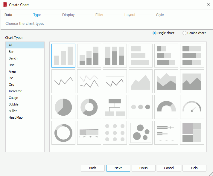
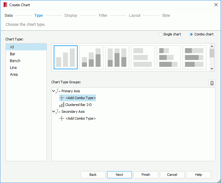
The Create Chart wizard appears, which contains a set of screens for helping you define a chart easily. You can use the Back and Next buttons or click the screen name on the screen navigation bar to switch between the screens.
 . Most often combo charts will use a bar chart on the primary axis and a line chart on the secondary axis to make a readable chart.
The following shows defining the data on a chart generally. If you have selected the Org or Heat Map chart type, data on the chart are specified differently (for details see Defining the data for an organization chart and Defining the data for a heat map).
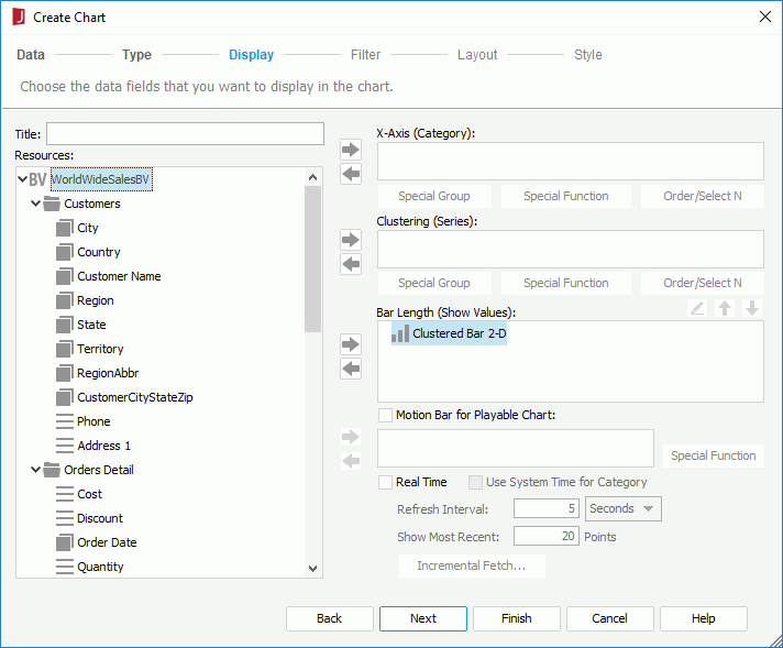
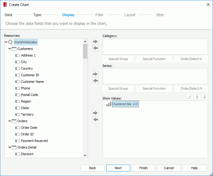
The Resources box lists all the view elements in the specified business view, and the dynamic formulas and aggregations created for the business view in the current report. Add them to the category, series and value axes of the chart respectively. You can also create more dynamic resources to use in the chart if needed.
 , detail object
  , dynamic formula used as Group
  , or dynamic formula used as Detail
  , then click
  beside the Category box or drag and drop it from the Resources box to the Category box. You can define special group, special function and Order/Select N condition on the field if required., or dynamic formula used as Group , then click beside the Series box or drag and drop it from the Resources box to the Series box. You can also define special group, special function and Order/Select N condition on the field if required.
 , a group object /detail object that is of Numeric type (an indicator chart also supports String or Boolean type), dynamic aggregation , dynamic formula used as Aggregation , dynamic formula used as Group /Detail that returns Numeric values (for an indicator chart String or Boolean value too), or an additional value, then click beside the Show Values box or drag and drop it from the Resources box to the Show Values box. You can add multiple fields on the value axis and use
  or
or  to adjust the display order of the fields on the axis. If you are creating a combo chart, specify the fields on the value axis of each subtype respectively. For a bubble chart, the Show Values box contains three nodes: X-Axis, Y-Axis and Size and you need to specify the fields to display on the bubble X axis and Y axis and the field to determine the size of the bubbles respectively. When a field is added for the bubble X axis, this field will be displayed on the category axis instead of the one specified in the Category box, while the field defined in the Category box will still be included in data calculation. See Creating Motion Charts for a bubble chart example.
Tip: When the category field is a detail object, aggregation objects cannot be used on the value axis, and vice versa. On the value axis, group objects and detail objects cannot be used together with aggregation objects, and for an indicator chart, group objects and detail objects that are of different data types cannot be mixed either.
If you want to remove any field from the chart, select it in the corresponding axis box and click  or drag and drop it to the Resources box. You can also make the chart a real time chart or a motion chart.
To add an additional value to the value axis:
beside the Show Values box. The Edit Additional Value dialog appears.
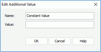
If you want to further modify a constant/average value, select the value in the Show Values box, then click  . In the Edit Additional Value dialog, edit the value as required.
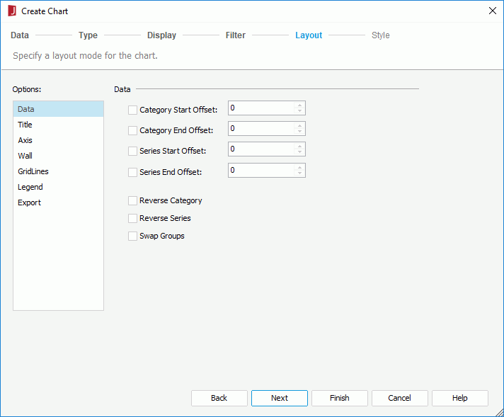
The following shows the layout options in general. Some options may not be available for certain chart types.
| Option Type | Option Name | Description |
|---|---|---|
| Data | Category Start Offset | Specifies the start offset of category from which the chart will be displayed. |
| Category End Offset | Specifies the end offset of category to which the chart will be displayed. | |
| Series Start Offset | Specifies the start offset series from which the chart will be displayed. | |
| Series End Offset | Specifies the end offset of series to which the chart will be displayed. | |
| The above four options work together to control the range of the data to be displayed on the chart. Click here for more information. | ||
| Reverse Category | Specifies whether to reverse the display order of the categories. | |
| Reverse Series | Specifies whether to reverse the display order of the series. | |
| Swap Groups | Specifies to display values from different data fields by switching data between the category and series axes, the category and values axes. | |
| Title | Chart Title | Specifies the title of the chart. |
| Category (X) Axis Title | Specifies the title of the X-axis. | |
| Value (Y) Axis Title | Specifies the title of the Y-axis. | |
| Value (Y2) Axis Title | Specifies the title of the Y2-axis. | |
| Axis | Show Category (X) Axis | Specifies whether to show the category (X) axis in this chart. |
| Show Value (Y) Axis | Specifies whether to show the value (Y) axis in this chart. | |
| Show Value (Y2) Axis | Specifies whether to show the value (Y2) axis in this chart. | |
| Show Series (Z) Axis | Specifies whether to show the series (Z) axis in this chart. | |
| If you choose not to display a certain axis, the labels and tick marks along the axis will be hidden as well. | ||
| Wall | Show Wall | Specifies whether to show the wall in this chart. |
| Show Floor | Specifies whether to show the floor in this chart. | |
| Gridlines | Show Category (X) Axis Gridlines | Specifies whether to show the gridlines of category (X) axis. |
| Show Value (Y) Axis Gridlines | Specifies whether to show the gridlines of value (Y) axis. | |
| Show Value (Y2) Axis Gridlines | Specifies whether to show the gridlines of value (Y2) axis. | |
| Show Series (Z) Axis Gridlines | Specifies whether to show the gridlines of series (Z) axis. | |
| Top Down | Specifies to expand the org chart tree from top to bottom. | |
| Bottom Up | Specifies to expand the org chart tree from bottom to top. | |
| Left Right | Specifies to expand the org chart tree from left to right. | |
| Legend | Show Legend | Specifies whether to show the legend in this chart. |
| Export | Mapping Component | This option is disabled when creating a chart. It specifies the component to which the chart will be mapped. For details, see Creating Dynamic Charts in Excel. |
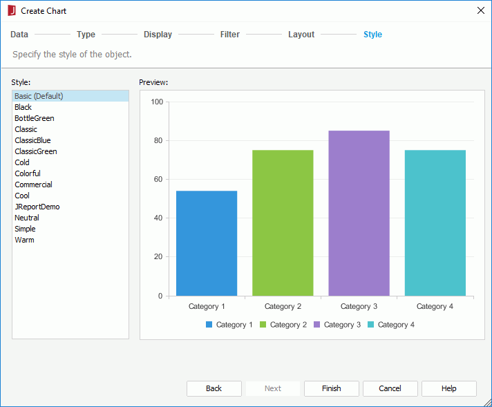
When you have specified to insert the chart into a banded object in a page report, by default the chart will inherit its parent's style. If you want to apply another style to the chart, uncheck the Inherit Style option and then select the required style from the Style box.
If you have selected a panel in a banded object as the chart destination, after finishing the wizard you need to click the mouse button in the destination once again in order to insert the chart there.
The Create Chart wizard appears, which contains a set of screens for helping you define a chart easily. You can use the Back and Next buttons or click the screen name on the screen navigation bar to switch between the screens.
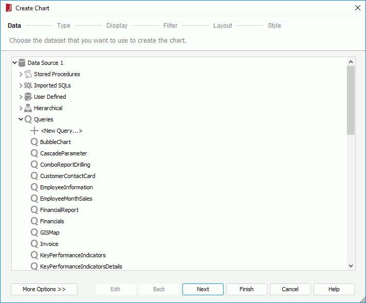
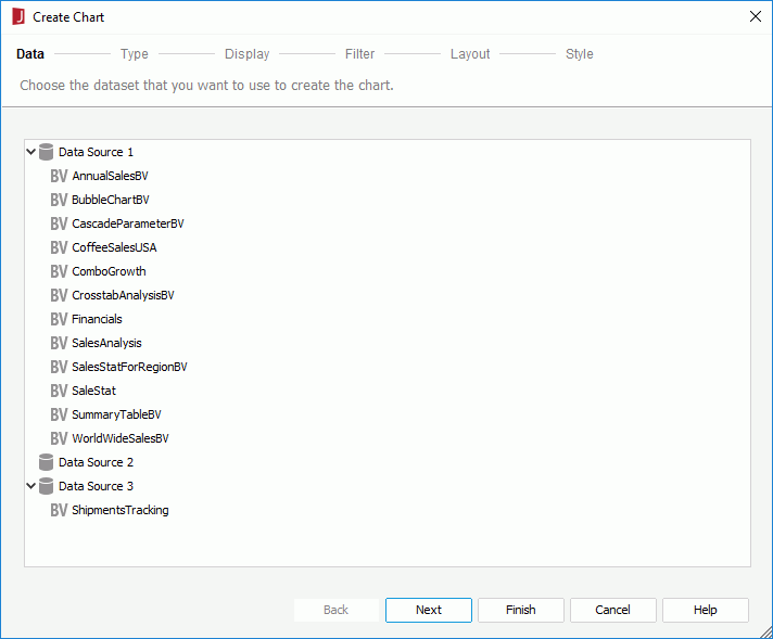
If the predefined data resources are not what you want, you can click the first item in the corresponding resource node to create one. When a query is selected, click the Edit button to modify the query if required. Then a new dataset based on the selected data resource is created in the page report.
If you want to use an existing dataset in the current page report to create the chart, click the More Options button and then:
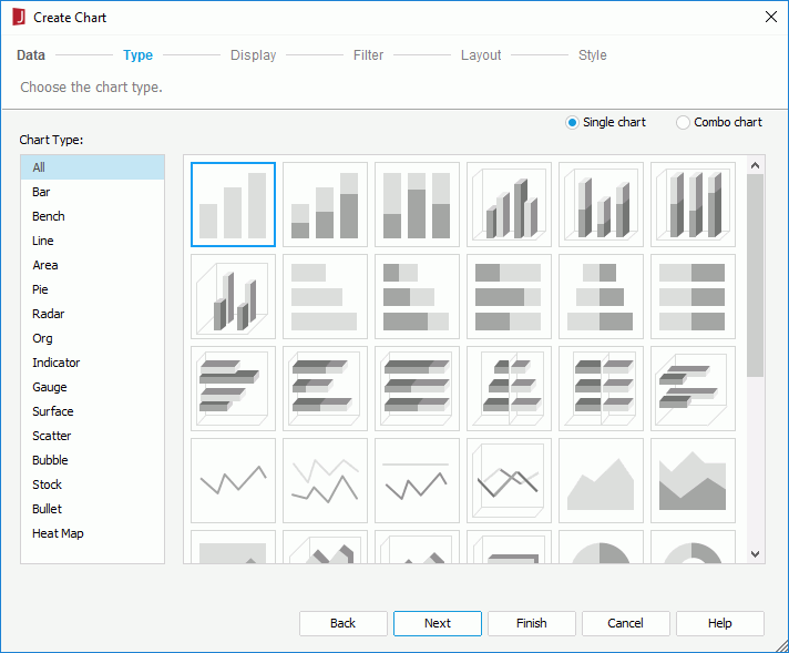
The following shows defining the data on a chart generally. If you have selected the Org or Heat Map chart type, data on the chart are specified differently (for details see Defining the data for an organization chart and Defining the data for a heat map).
The Resources box lists all the DBFields in the specified data resource as well as the valid formulas and summaries of the DBFields in the current catalog. When the predefined formulas or summaries cannot meet your requirements, you can click <New Formula...> in the Formulas node to create formulas, or <New Summary...> in the Summaries node to create summaries to use in the chart (if the chart is to be inserted in a banded object and it inherits the parent's dataset, make sure the summaries take Down group by level if you want to use dynamic summaries). Add them to the chart axes to define the chart.
beside the Category/Series box or drag and drop it from the Resources box to the target box. You can define special group, special function and Order/Select N condition on the field if required. beside the Show Values box or drag and drop it from the Resources box to the Show Values box. You can add multiple fields on the value axis and use or to adjust the display order of the fields on the axis. If you are creating a combo chart, you need to specify the fields on the value axis of each subtype respectively.
For a bubble chart, the Show Values box contains three items: X Axis, Y Axis and Radius. You need to specify the fields to display on the bubble X axis and Y axis and the field to determine the size of the bubbles respectively. When a field is added for the bubble X axis, this field will be displayed on the category axis instead of the one specified in the Category box, while the field defined in the Category box will still be included in data calculation. See Creating Motion Charts for a bubble chart example.
For a back-to-back chart, you need to specify how the comparison on the value axis of the chart is. For details, see Defining the values to be compared on a back-to-back chart.
Tips:
If you want to remove any field from the chart, select it in the corresponding axis box and click or drag and drop it to the Resources box.
When you have specified to insert the chart into a banded object, by default the chart will inherit its parent's style. If you want to apply another style to the chart, uncheck the Inherit Style option and then select the required style from the Style box.
If you have selected a panel in a banded object as the chart destination, after finishing the wizard you need to click the mouse button in the destination once again in order to insert the chart there.
An organization (org) chart is a tree-structure diagram showing hierarchical relationships of one people to another, one position to another, one department to another and so on in an organization. The hierarchical relations are defined by the node field and parent field. The node field values are displayed as nodes in the org chart, and two nodes that have hierarchical relationship are connected by a line. All the relations will finally go to one root node which presents the top level position. The closer to the top root node, the higher the level.
Org chart nodes are also containers in which data objects, labels and images can be inserted. In this way you can add the information you want to display in the nodes to get data about each node.
To define the data to display in an org chart, in the Display screen of the Create Chart wizard:
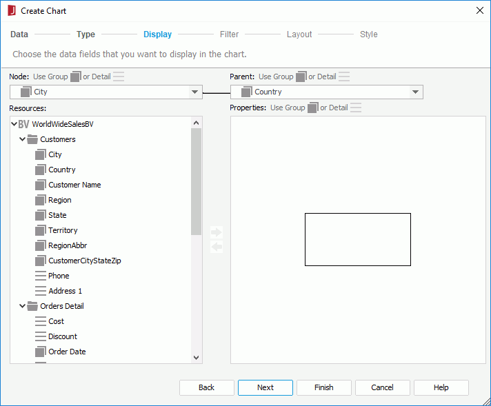
In the following example, the node field contains three employee names: Tony, Amanda and Jack, and the parent field is also about employee names and contains Amanda who is the leader of Tony and Jack who is the leader of Amanda. Jack will be the top root node of the org chart.
| Employee Name (node field) | Leader Name (parent field) |
|---|---|
| Tony | Amanda |
| Amanda | Jack |
| Jack |
To add an object, select it in the Resources box, then click or drag and drop it to the node model. You can resize the node model and adjust the position and size of the added objects in the node model as required, which can also be performed in the Design area of JReport Designer after the chart is created. To remove an unwanted object from the node model, select it and click or press Delete on the keyboard.
A heat map displays data in a matrix as rectangles marked by colors and sizes. Multiple group levels are translated into rectangles representing a higher-level group further divided into smaller rectangles that represent the lower level group. The rectangles representing the lowest-level group are called the innermost rectangles. Group-by fields and summarized data can be displayed in the innermost rectangles for showing the group values and for calculating data of the groups. Each rectangle has a title which shows the corresponding group value and is by default hidden for better appearance (to have the title of a rectangle shown, locate its Rectangle Title node in the Report Inspector and set the Invisible property to false).
To define the data to display in a heat map, in the Display screen of the Create Chart wizard:
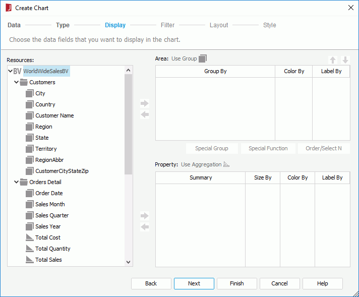
beside the Area box or drag and drop it from the Resources box to the Area box to add a group in the heat map. Repeat this to add more groups. You can use and above the Area box to adjust the group levels. To remove a group from the heat map, select it in the Area box and click or drag and drop it to the Resources box.
When creating the heat map using a business view, you can use the group objects in the specified business view or the dynamic formulas used as Group created for the business view in the current report as the group-by fields. When creating using a query resource, any DBField or formula in the Resources box can be used as the group-by fields.
When creating the heap map using a business view, you can add aggregation objects , dynamic aggregations and dynamic formulas used as Aggregation to calculate data. When creating using a query resource, if no group is added in the Area box, you can insert any dynamic summary or static summary, and the group-by field of the static summary will be inserted into the Area box automatically; if there are multiple groups, the static summaries to be inserted should match the lowest-level group. For example, if the group levels are A > B > C, the static summaries grouped by C can be inserted into the Summaries box, but the static summaries grouped by A, B or other fields cannot.
After a heat map is created, you can further edit it in the design area. Only the first rectangle which represents the lowest group level in the heap map is editable and can contain objects. You can insert the group fields of the heat map from the Data panel, as well as labels and images via the Components panel into it. For the objects in the rectangle, you can edit or delete them just like they do in a text box. The inserted objects do not support absolute position since the width and height of the rectangle are determined dynamically at runtime.
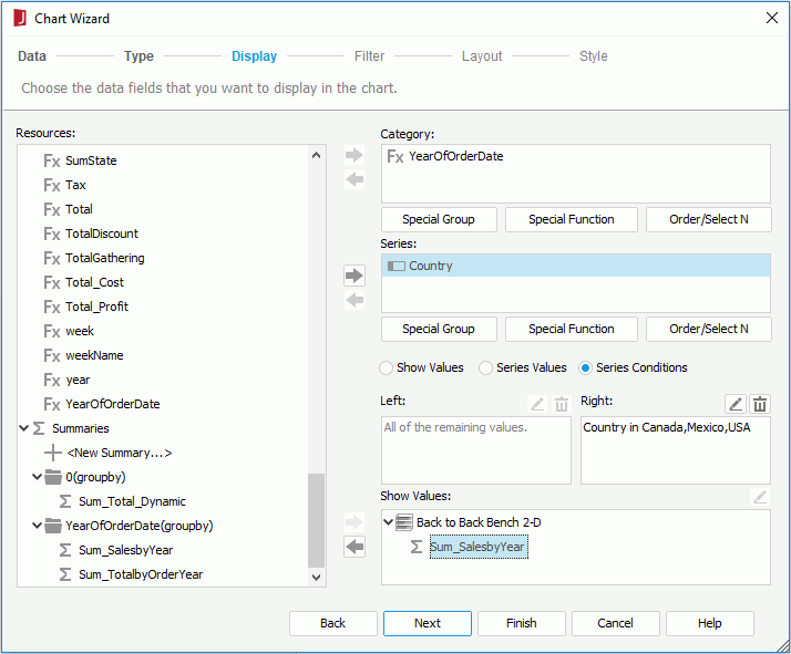
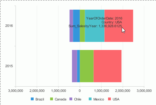
A back-to-back bench chart is used for comparing values on the value axis. It displays and compares the contribution of each data value on the origin left and origin right across categories. For example, you may want a chart that compares the sales of each country in Latin America and North America, you can then use a back-to-back chart to display category Year and series Country, and define a condition on the series to make the Latin American countries display on the origin left of the category axis and North American countries on the origin right. Then you get to easily see not only the individual countries but can compare both regions.
When you define how the comparison on the value axis of a back-to-back bench chart is created, you can either add two values on the origin left and origin right of the value axis to compare if it is a 2-D chart, or make the comparison based on the series field values if the chart contains a series field. When the comparison is based on series values, you need to further define the series values to display on the origin left and origin right of the value axis: either manually or use a condition.
To make the comparison based on fields displayed on the value axis of a 2-D back-to-back bench chart:
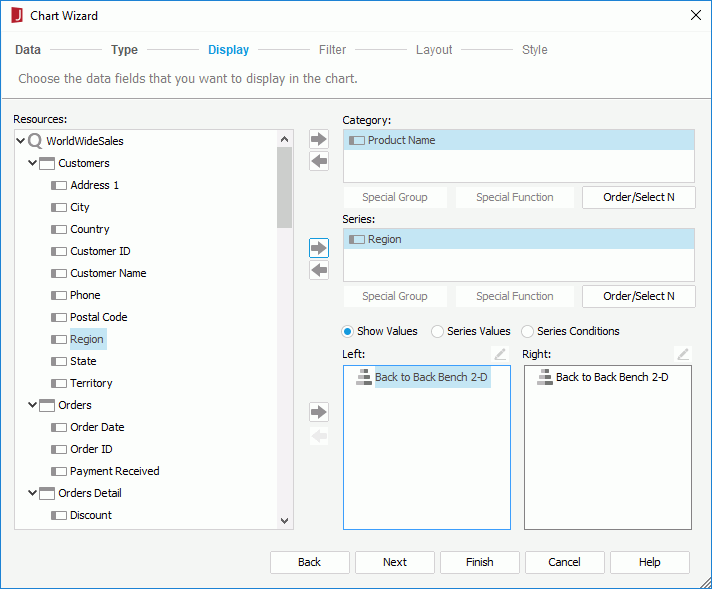
or drag and drop the field to the Left or Right box.To remove the field added on either origin, select it and click or drag and drop it to the Resources box.
To compare based on the series field and define the series values manually:
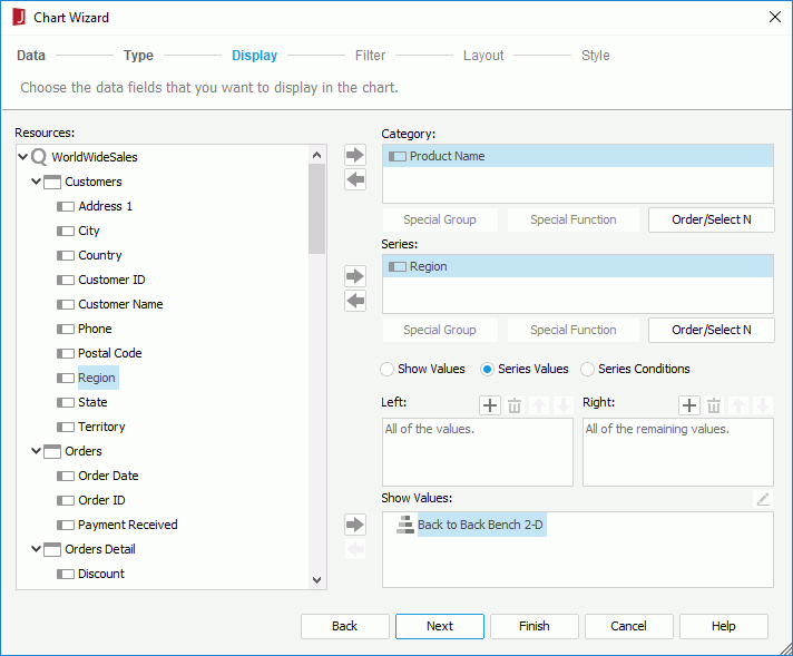
 above the Left/Right box to add a value line, double-click in the line and enter the required value of the series field.
To adjust the display order of the values, select a value and click or . To remove a value, select it and click .
When the chart is generated, the specified series values will be shown on the origin left/right of the value axis on the chart and the undefined values of the series field on the opposite origin.
To compare based on the series field and use a condition to define the series values:
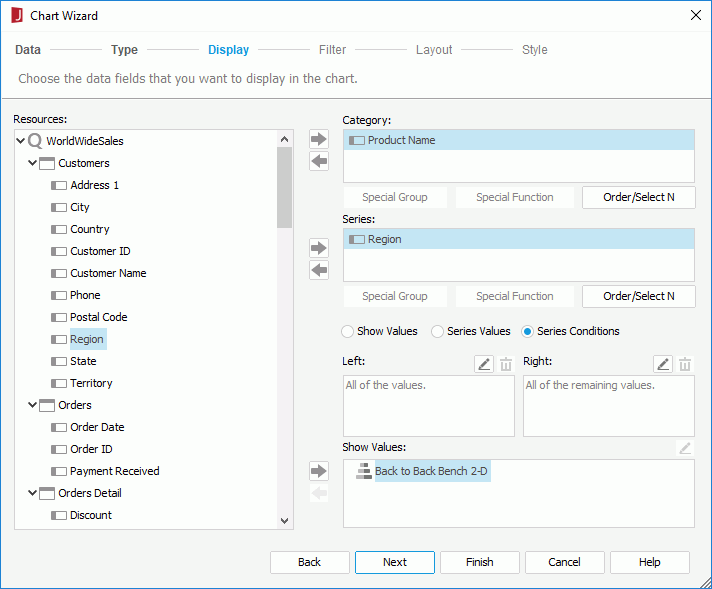
above the Left/Right box. The Edit Conditions dialog appears.
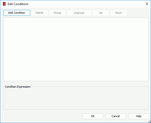
To make some condition lines grouped, select them and click the Group button, then the selected condition lines will be added in one group and work as one line of filter expression. Conditions and groups together can be further grouped. To take any condition or group in a group out, select it and click Ungroup.
To adjust the priority of the condition lines, select it and click the Up or Down button.
To delete a condition line, select it and click the Delete button.
Click OK to finish defining the condition. The condition expression is displayed in the Left/Right box.
When the chart is generated, the series values that meet the specified condition will be shown on the origin left/right of the value axis on the chart and the remaining values of the series field on the opposite origin.
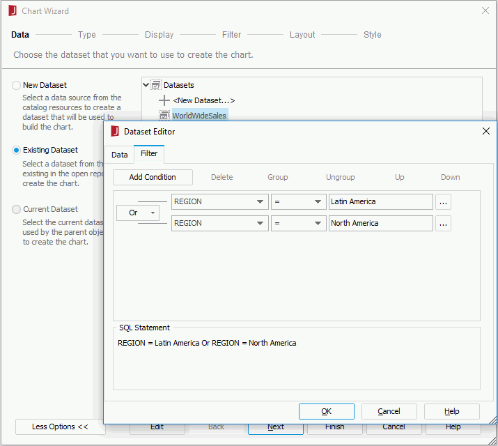
Example of creating a back-to-back bench chart
Suppose you want to have a chart to compare the sales for individual countries in Latin America and North America, you can create it as follows:
<install_root>\Demo\Reports\SampleReports.Next we will filter the dataset to use data in the Latin America and North America regions only. By using dataset filter, the reports that use the same query will not be affected.
above the Right box.