 Previous Page Next Page
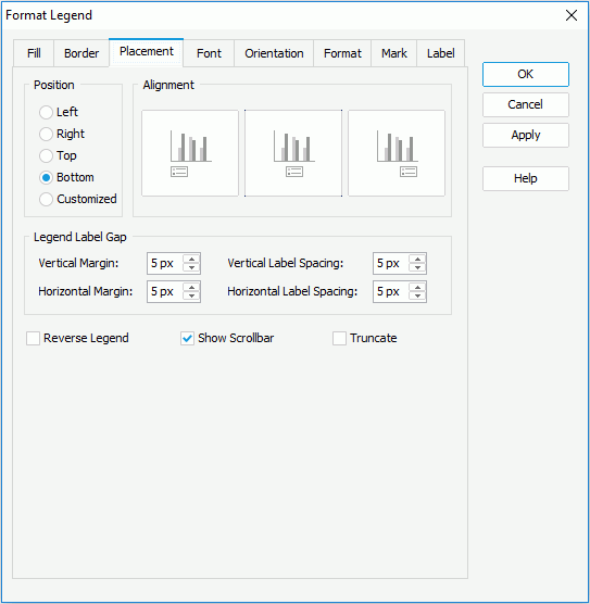
In the Position box, specify whether the legend will be placed at the left, right, top, or bottom of the chart, and then set the alignment style accordingly in the Alignment box. If Auto is selected, the legend will be placed somewhere automatically.
In the Legend Label Gap box, specify the vertical and horizontal margins between the legend entries and the legend boundaries, and the vertical and horizontal spacing between legend entry labels.
Check Reverse Legend if you want to have the legend entries re-arranged in a reverse order. To show the legend scrollbar to fully view the legend content when the content does not fit into the legend, check Show Scrollbar. Check Truncate to truncate the legend entry label text when the text overflow the labels.
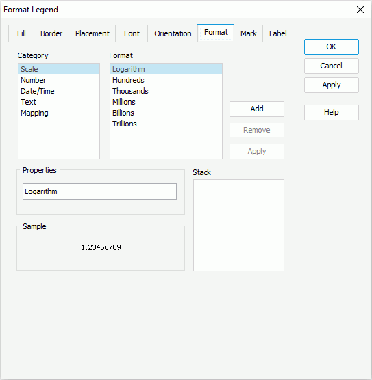
Select a category from the Category box, then select a format from the Format box and click Add to add it to the Stack box (for details about each format, click here). You can add more than one format, and in the event that one of the formats is not necessary, you can clear it by clicking Remove.
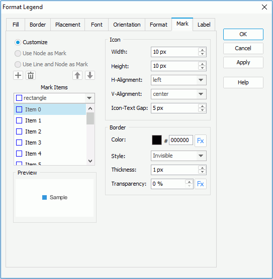
By default, Customize is checked, which enables you to customize the format of the legend entry marks. JReport Designer uses 16 styles for the marks by default. To add a style, select a mark item from the Mark Items drop-down list, and then click  to add it to the Mark Items box. The legend entry marks will repeat within the mark items you have defined. If you have defined more mark items than the actual legend entry marks, the redundant mark items will be ignored. You can click
  ,
,  , or
, or  to remove a mark item, or to arrange the order of the items. To change the style of a mark item, select it in the Mark Items box and then choose a new one from the Mark Items drop-down list.
In the Icon box, specify the horizontal and vertical alignment styles, and the gap between each entry mark and entry label. You can also set the width and height for the legend entry marks.
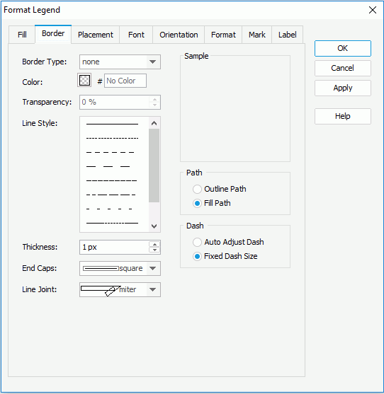
In the Border box, set the color, style, thickness and transparency properties of the icon border. If the chart is created using a query resource, you can use a formula to control the border color and transparency.
For a line chart, you can also check Use Node as Mark or Use Line and Node as Mark to apply the style and color of the line nodes or lines and line nodes automatically to the legend entry marks. When either of these two is checked, you can also specify the properties of icons in the Icon box.
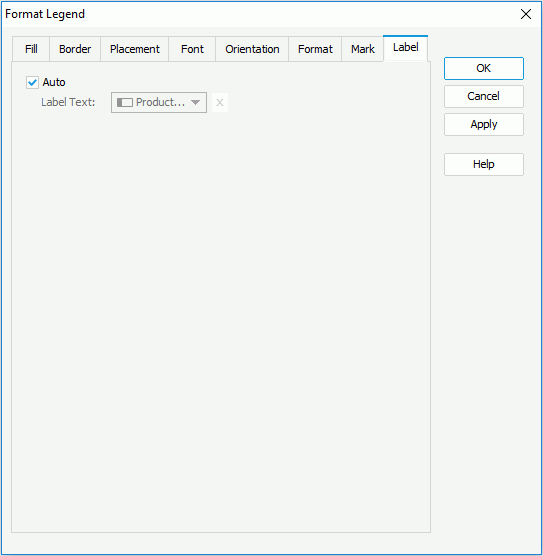
Uncheck Auto, then from the Label Text drop-down list select a field the values of which will be displayed as the entry labels, or use a formula to control the label text. You can also click  to input the desired label text manually.
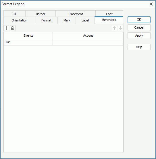
Select a trigger event from the drop-down list in the Events column, then click in the Actions column and click  that appears in the text box to open the Web Action List dialog, where you can bind a web action to the legend the same as you do to a label in the library component, which will be triggered when the specified event occurs on the legend. The web actions you can bind include Filter, Sort, Parameter, Property and SendMessage.
To add a web behavior line, click , and if a web behavior is not required, click to remove it.
Click or to adjust the order of the behaviors. Then, when an event that has been bound with more than one action happens, the upper action will be triggered first.