 Previous Page Next Page
The format options for a gauge vary with the gauge subtypes: Gauge Solid 2-D, Gauge Dial 2-D, Gauge Activity 2-D, Gauge Bar 2-D, and Gauge Bubble 2-D.
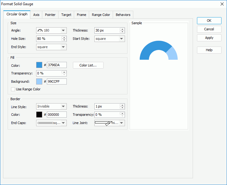
In the Size box, set the angle of the arcs (you can select the angle from the drop-down list or select Customized to open the Customize Gauge Angle dialog to specify the start angle and stop angle), the width of the arcs, the relative size of an arc, and the styles of the start graph and end graph of the arcs.
In the Fill box, specify the color, transparency and background color of the arcs (to change the color, click the color image and select a color from the color palette or input the hexadecimal value of a color directly in the text box), and if required, click the Color List button to specify the color pattern for pointers in the same data series respectively in the Color List dialog. If you want to use the color defined for the ranges as the arc color, check Use Range Color.
In the Border box, set the line style, thickness, color, transparency, ending style and line joint style for borders of the arcs.
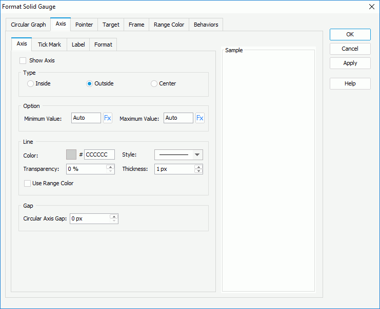
Check Show Axis to display axis in the solid gauge, then in the Type box, specify the position of the axis, which can be inside, outside or in the center of the arcs.
In the Option box, specify the minimum and maximum values to be displayed on the axis or use a formula to control the values.
In the Line box, specify the color and transparency of the axis or check Use Range Color to use the color defined for the ranges as the axis color. Specify the style and thickness of the axis.
In the Gap box, specify the gap between the axis and the arcs if the axis is displayed inside or outside of the arcs.
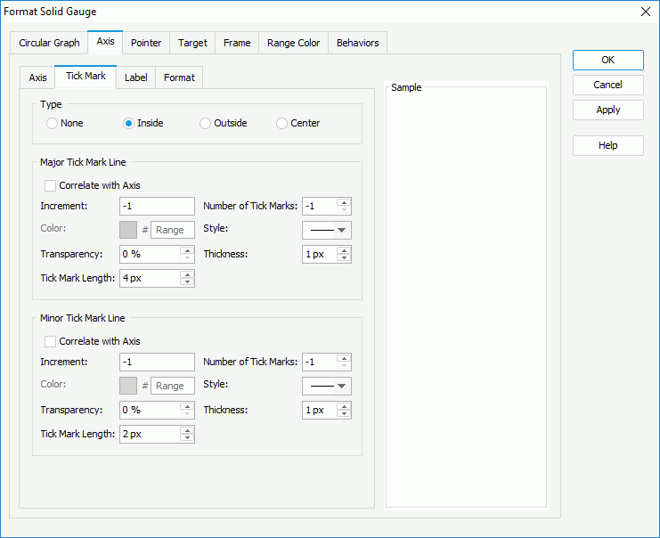
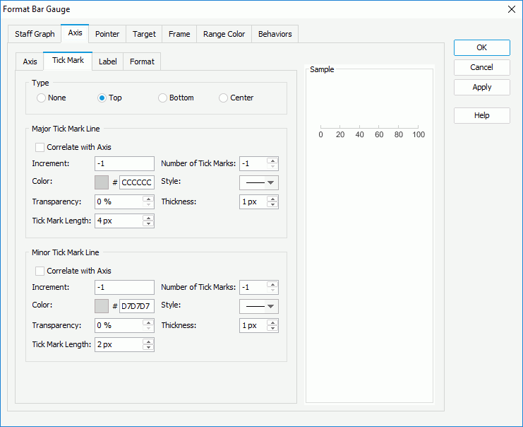
To display tick marks on the axis, check how to show it in the Type box: inside, outside or in the center of the axis.
In the Major Tick Mark Line and Minor Tick Mark Line boxes, specify the distance between two adjacent tick marks on the axis, how many tick marks to display on the axis, and the color, style, transparency, thickness and length of the tick marks respectively. If you want to use the same line setting as that of the axis for the tick mark lines, check Correlate with Axis.
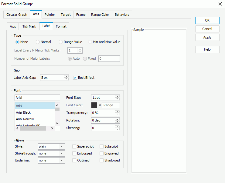
In the Type box, specify the type of the data labels.
In the Gap box, specify the distance between the data labels and the axis in pixels and whether to adjust the labels automatically to make them placed best. When Best Effect is checked, some labels will be hidden when they are overlapped.
In the Font box, format the font of the data labels, including the font face, size, color, transparency, rotation angle and shearing angle.
In the Effects box, specify the font effects of the data labels, including the style, strikeout, underline and so on.
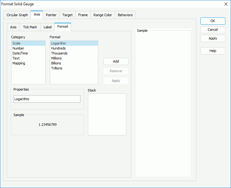
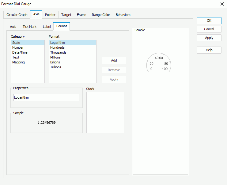
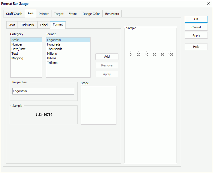
Select a category from the Category box, then select a format from the Format box and click Add to add it to the Stack box. If the formats listed in the Format box cannot meet your requirement, define the format in the Properties text box and click Add to add it as the format of the selected category. You can add more than one format, but for each category only one format can be added. In the event that a format is not necessary, select it in the Stack box click Remove to clear it.
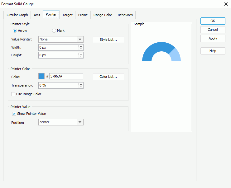
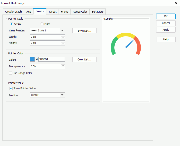
In the Pointer Style box,
In the Pointer Color box, specify the color and transparency of the pointers, and if required, click the Color List button to specify the color pattern for pointers in the same data series respectively in the Color List dialog. If you want to use the color defined for the ranges as the pointer color, check Use Range Color.
In the Pointer Value box, specify whether to show values for the pointers and the position relationship between the values and the pointers. You can select the position from the drop-down list or select customized to customize the position by dragging any pointer value in the design area.
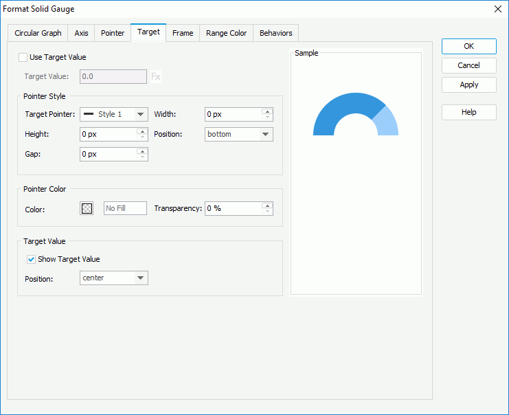
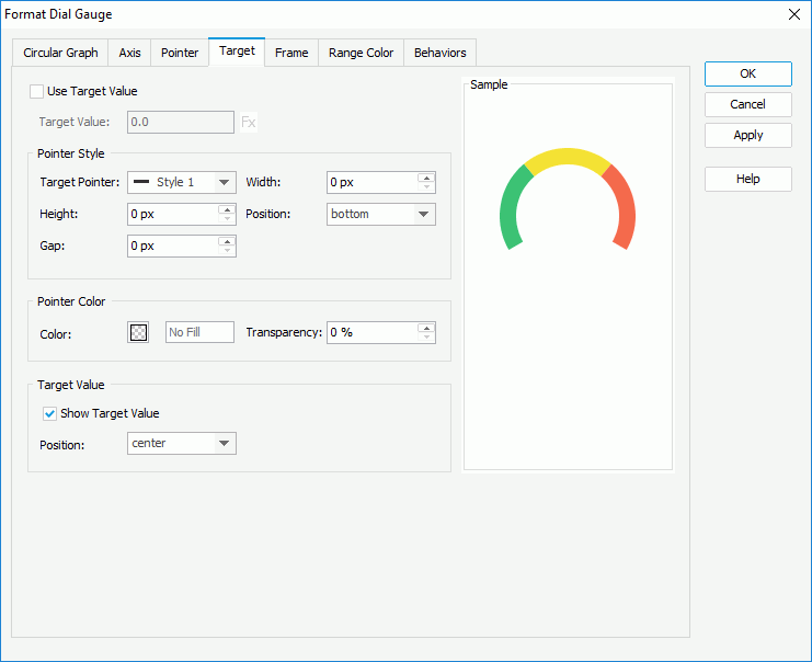
Check Use Target Value if you want to use target value for the solid gauge, and specify the target value as required. You can input the value in the text box directly or use a formula to control the value.
In the Pointer Style box, select the style of the target pointer from the Target Pointer drop-down list. Specify the width and height of the target pointer, the position of the target pointer relative to the arc, and the distance between the target pointer and the arc.
In the Pointer Color box, specify the color and transparency of the target pointer.
In the Target Value box, specify whether to show the target value on the solid gauge and the position of the target value relative to the arc. You can select the position from the drop-down list or select customized to customize the position by dragging the target value in the design area.

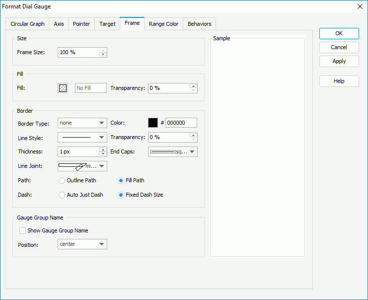
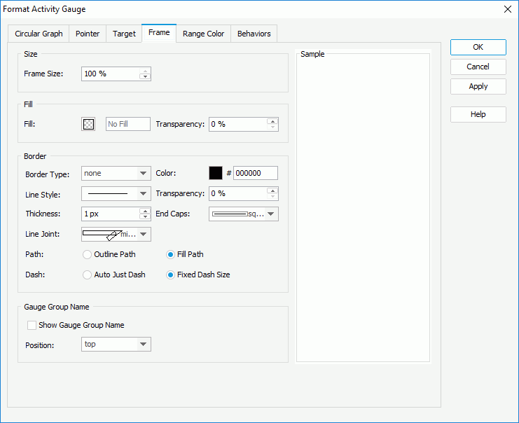
In the Size box, specify the size of the frame.
In the Fill box, specify the color and the transparency of the color to fill the frame.
In the Border box, specify the properties for borders of the frame, including the type, color, line style, transparency, thickness, ending style, line joint style, fill pattern and dash size.
In the Gauge Group Name box, specify whether to show names for the arcs in the solid gauge which are values of the field on its category axis, and the position of the names relative to the arcs. If the solid gauge contains no category field, the group name shows Report by default.
 , and if a color range is not required, click
  to remove it. Then in the Others box, specify the name and color for the values that do not fall into any of the ranges you define.

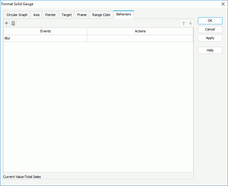
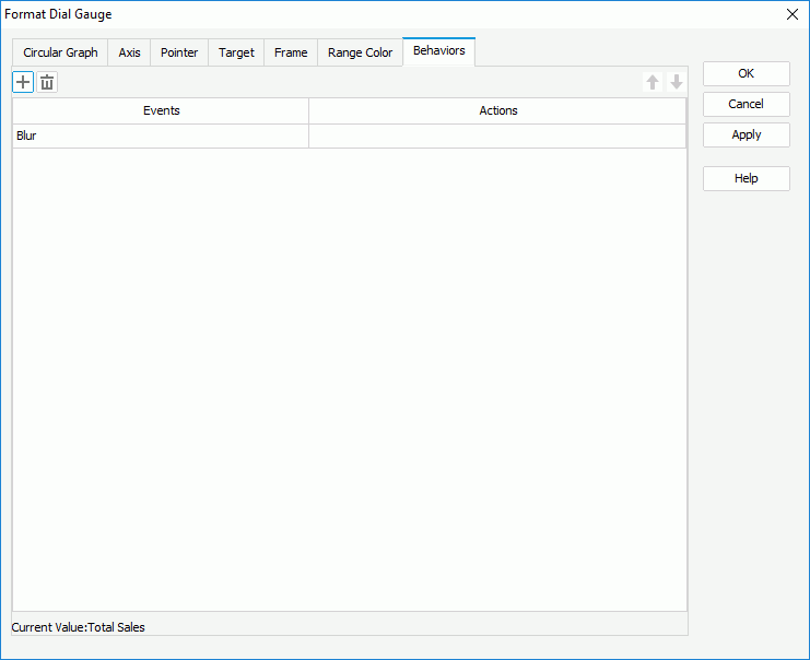
Select a trigger event from the drop-down list in the Events column, then click in the Actions column and click  that appears in the text box. In the Web Action List dialog, bind a web action to the solid gauge the same as you do to a label in the library component, which will be triggered when the specified event occurs on the solid gauge pointers. The web actions you can bind include Parameter, Filter, Sort, Change Property and Send Message.
To add more web behaviors, click and define them as required; if a web behavior is not required, select it and click . Click  or
or  to adjust the order of the behaviors, then at runtime when an event that has been bound with more than one action happens, the upper action will be triggered first.
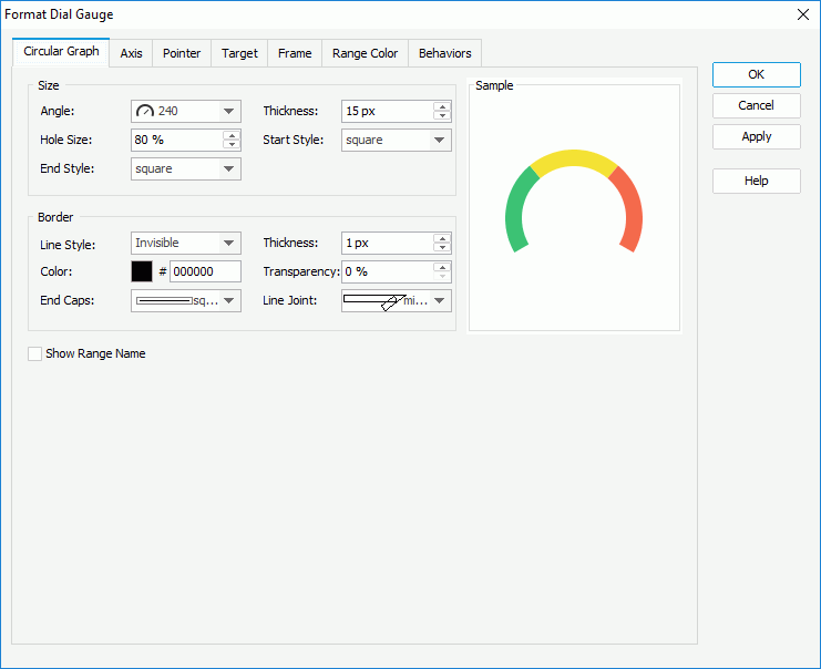
In the Size box, set the angle of the dials (you can select the angle from the drop-down list or select Customized to open the Customize Gauge Angle dialog to specify the start angle and stop angle), the width of the dials, the relative size of a dial, and the styles of the start graph and end graph of the dials.
In the Border box, set the line style, the thickness, the color, the transparency, the ending style and line joint style for borders of the dials.
Specify whether to show the names of the ranges you define.
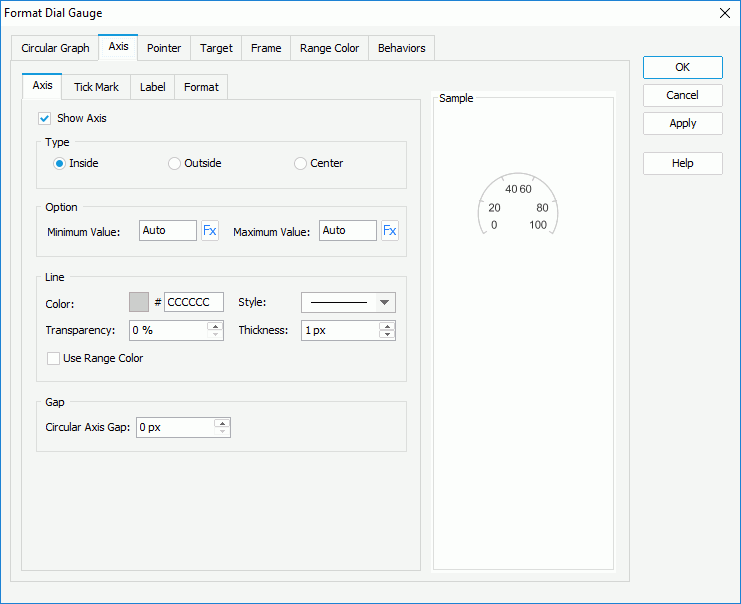
Check Show Axis to display the axis. In the Type box, specify the position of the axis, which can be inside, outside or in the center of the dials.
In the Option box, specify the minimum and maximum values to be displayed on the axis, or use a formula to control the values. The values will be equally divided into three ranges, each of which will be filled with the color specified in the Color Range tab automatically.
In the Line box, specify the color and transparency of the axis or check Use Range Color to use the color defined for the ranges as the axis color. Specify the style and thickness of the axis.
In the Gap box, specify the gap between the axis and the dials if the axis is displayed inside or outside of the arcs.
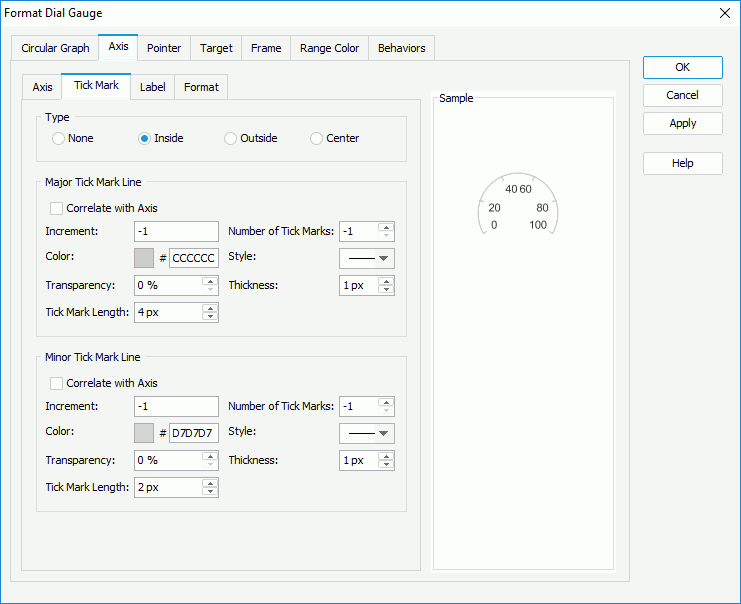
To display tick marks on the axis, check how to show it in the Type box: inside, outside or in the center of the axis.
In the Major Tick Mark Line and Minor Tick Mark Line boxes, specify the distance between two adjacent tick marks on the axis, how many tick marks to display on the axis, and the color, style, transparency, thickness and length of the tick marks respectively. If you want to use the same line setting as that of the axis for the tick mark lines, check Correlate with Axis.
In the Label sub tab, specify properties for the data labels on the axis.
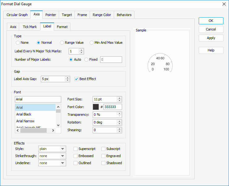
In the Type box, specify the type of the data labels.
In the Gap box, specify the distance between the data labels and the axis in pixels and whether to adjust the labels automatically to make them placed best. When Best Effect is checked, some labels will be hidden when they are overlapped.
In the Font box, format the font of the data labels, including the font face, size, color, transparency, rotation angle and shearing angle.
In the Effects box, specify the font effects of the data labels, including the style, strikeout, underline and so on.
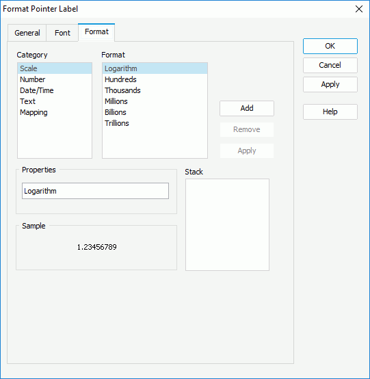
Select a category from the Category box, then select a format from the Format box and click Add to add it to the Stack box. If the formats listed in the Format box cannot meet your requirement, define the format in the Properties text box and click Add to add it as the format of the selected category. You can add more than one format, but for each category only one format can be added. In the event that a format is not necessary, select it in the Stack box click Remove to clear it.
In the Pointer Style box,
In the Pointer Color box, specify the color and transparency of the pointers, and if required, click the Color List button to specify the color pattern for pointers in the same data series respectively in the Color List dialog. If you want to use the color defined for the ranges as the pointer color, check Use Range Color.
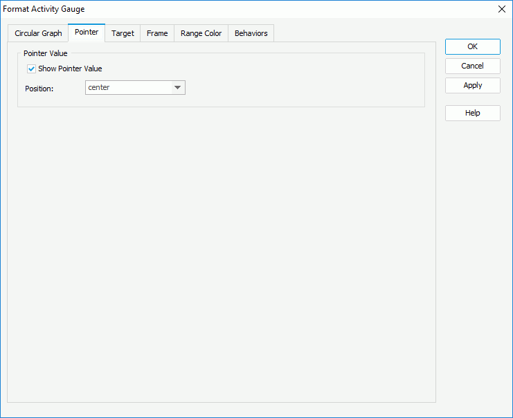
In the Pointer Value box, specify whether to show values for the pointers and the position relationship between the values and the pointers. You can select the position from the drop-down list or select customized to customize the position by dragging any pointer value in the design area.
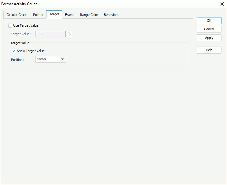
Check Use Target Value if you want to use target value for the dial gauge, and specify the target value as required. You can input the value in the text box directly or use a formula to control the value.
In the Pointer Style box, select the style of the target pointer from the Target Pointer drop-down list. Specify the width and height of the target pointer, the position of the target pointer relative to the arc, and the distance between the target pointer and the dial.
In the Pointer Color box, specify the transparency for color of the target pointer.
In the Target Value box, specify whether to show the target value on the dial gauge and the position of the target value relative to the dial. You can select the position from the drop-down list or select customized to customize the position by dragging the target value in the design area.
In the Size box, specify the size of the frame.
In the Fill box, specify the color and the transparency of the color to fill the frame.
In the Border box, specify the properties for borders of the frame, including the type, color, line style, transparency, thickness, ending style, line joint style, fill pattern and dash size.
In the Gauge Group Name box, specify whether to show names for the arcs in the dial gauge which are values of the field on its category axis, and the position of the names relative to the arcs. If the dial gauge contains no category field, the group name shows Report by default.
, and if a color range is not required, click to remove it. Then in the Others box, specify the name and color for the values that do not fall into any of the ranges you define.

Select a trigger event from the drop-down list in the Events column, then click in the Actions column and click that appears in the text box. In the Web Action List dialog, bind a web action to the dial gauge the same as you do to a label in the library component, which will be triggered when the specified event occurs on the dial pointers. The web actions you can bind include Parameter, Filter, Sort, Change Property and Send Message.
To add more web behaviors, click and define them as required; if a web behavior is not required, select it and click . Click or to adjust the order of the behaviors, then at runtime when an event that has been bound with more than one action happens, the upper action will be triggered first.
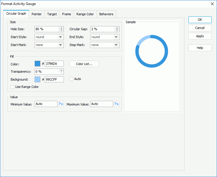
In the Size box, set the relative size of an arc, the distance between the arcs, and the styles and marks for the start graph and end graph of the arcs.
In the Fill tab, specify the color, transparency and background color of the arcs (to change the color, click the color image and select a color from the color palette or input the hexadecimal value of a color directly in the text box), and if required, click the Color List button to specify the color pattern for pointers in the same data series respectively in the Color List dialog. If you want to use the color defined for the ranges as the arc color, check Use Range Color. To use colors that are lighter than the arcs automatically as the background color, check Auto, then Background is disabled.
In the Value box, specifies the minimum and maximum values to be displayed in the chart or use a formula to control the property.
In the Size box, specify the size of the frame.
In the Fill box, specify the color and the transparency of the color to fill the frame.
In the Border box, specify the properties for borders of the frame, including the type, color, line style, transparency, thickness, ending style, line joint style, fill pattern and dash size.
In the Gauge Group Name box, specify whether to show names for the arcs in the activity gauge which are values of the field on its category axis, and the position of the names relative to the arcs. If the activity gauge contains no category field, the group name shows Report by default.
, and if a color range is not required, click to remove it. Then in the Others box, specify the name and color for the values that do not fall into any of the ranges you define.

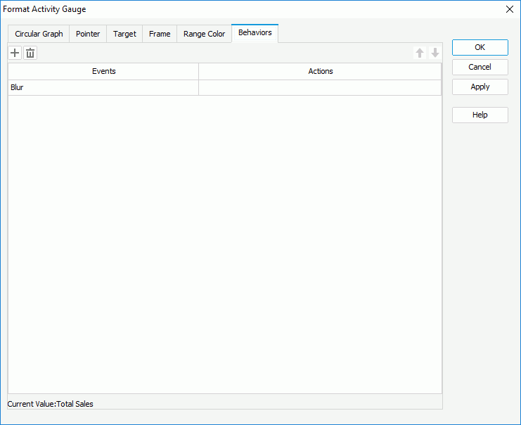
Select a trigger event from the drop-down list in the Events column, then click in the Actions column and click that appears in the text box. In the Web Action List dialog, bind a web action to the activity gauge the same as you do to a label in the library component, which will be triggered when the specified event occurs on the activity gauge pointers. The web actions you can bind include Parameter, Filter, Sort, Change Property and Send Message.
To add more web behaviors, click and define them as required; if a web behavior is not required, select it and click . Click or to adjust the order of the behaviors, then at runtime when an event that has been bound with more than one action happens, the upper action will be triggered first.
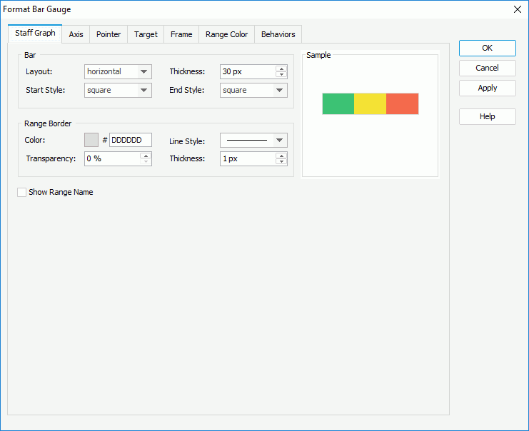
In the Bar box, decide the layout of the scales in the bar gauge, the thickness of the bars, and the style of the start graph and end graph of the bars.
In the Range Border box, set the color, style, transparency, and thickness of the scale borders (to change the color, click the color image and select a color from the color palette or input the hexadecimal value of a color directly in the text box).
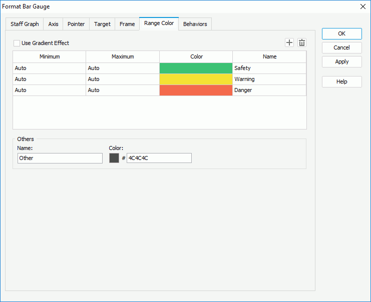
Specify whether to show the names of the ranges you have defined.
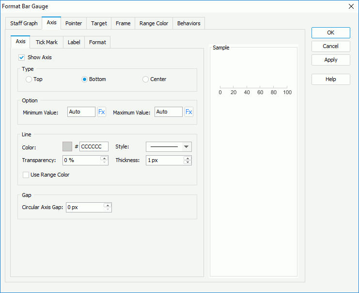
Check Show Axis to display axis in the bar gauge, then in the Type box, specify the position of the axis, which can be on the top or bottom of the bar, or in the center of the bar.
In the Option box, specify the minimum and maximum values to be displayed in the chart or use a formula to control the property. The values will be equally divided into three ranges, each of which will be filled with the color specified in the Color Range tab automatically.
In the Line box, specify the color and transparency of the axis or check Use Range Color to use the color defined for the ranges as the axis color. Specify the style and thickness of the axis.
In the Gap box, specify the gap between the axis and the bars if the axis is displayed inside or outside of the arcs.
To display tick marks on the axis, check how to show it in the Type box: on the top or bottom of the axis, or in the center of the axis.
In the Major Tick Mark Line and Minor Tick Mark Line boxes, specify the distance between two adjacent tick marks on the axis, how many tick marks to display on the axis, and the color, style, transparency, thickness and length of the tick marks respectively. If you want to use the same line setting as that of the axis for the tick mark lines, check Correlate with Axis.
In the Label sub tab, specify properties for the data labels on the axis.

In the Type box, specify the type of the data labels.
In the Gap box, specify the distance between the data label and the axis in pixels and whether to adjust the labels automatically to make them placed best. When Best Effect is checked, some labels will be hidden when they are overlapped.
In the Font box, format the font of the data labels, including the font face, size, color, transparency, rotation angle and shearing angle.
In the Effects box, specify the font effects of the data labels, including the style, strikeout, underline and so on.
Select a category from the Category box, then select a format from the Format box and click Add to add it to the Stack box. If the formats listed in the Format box cannot meet your requirement, define the format in the Properties text box and click Add to add it as the format of the selected category. You can add more than one format, but for each category only one format can be added. In the event that a format is not necessary, select it in the Stack box click Remove to clear it.
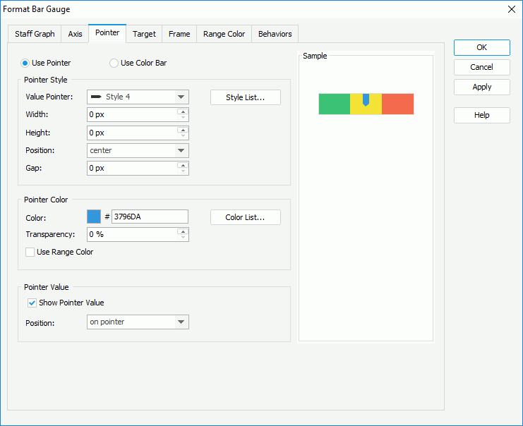
Specify the way to show the point: pointer or color bar.
In the Pointer Style box (available only when Use Pointer is checked), specify the style of the value pointer, the width and height of the pointer, the position relationship of the pointer and the bar, and the distance between the pointer and the bar in pixels. If required, click Style List to specify the style for pointers in the same data series respectively in the Style List dialog.
In the Pointer Color box, specify the color and transparency of the pointers, and if required, click the Color List button to specify the color pattern for pointers in the same data series respectively in the Color List dialog. If you want to use the color defined for the ranges as the pointer color, check Use Range Color.
In the Pointer Value box, specify whether to show values for the pointers and the position relationship between the values and the pointers. You can select the position from the drop-down list or select customized to customize the position by dragging any pointer value in the design area.
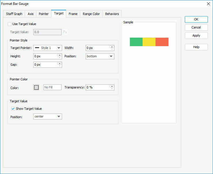
Check Use Target Value if you want to use target value for the bar gauge, and specify the target value as required. You can input the value in the text box directly or use a formula to control the value.
In the Pointer Style box, select the style of the target pointer from the Target Pointer drop-down list. Specify the width and height of the target pointer, the position of the target pointer relative to the bar, and the distance between the target pointer and the bar.
In the Pointer Color box, specify the transparency of the target pointer.
In the Target Value box, specify whether to show the target value on the bar gauge and the position of the target value relative to the bar. You can select the position from the drop-down list or select customized to customize the position by dragging the target value in the design area.

In the Size box, specify the size of the frame.
In the Fill box, specify the color and the transparency of the color to fill the frame.
In the Border box, specify the properties for borders of the frame, including the type, color, line style, transparency, thickness, ending style, line joint style, fill pattern and dash size.
In the Gauge Group Name box, specify whether to show names for the arcs in the bar gauge which are values of the field on its category axis, and the position of the names relative to the bars. If the bar gauge contains no category field, the group name shows Report by default.
, and if a color range is not required, click to remove it. Then in the Others box, specify the name and color for the values that do not fall into any of the ranges you define.
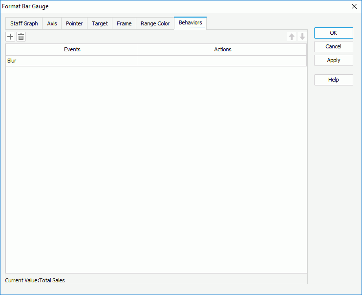
Select a trigger event from the drop-down list in the Events column, then click in the Actions column and click that appears in the text box. In the Web Action List dialog, bind a web action to the bar gauge the same as you do to a label in the library component, which will be triggered when the specified event occurs on the data marks. The web actions you can bind include Parameter, Filter, Sort, Change Property and Send Message.
To add more web behaviors, click and define them as required; if a web behavior is not required, select it and click . Click or to adjust the order of the behaviors, then at runtime when an event that has been bound with more than one action happens, the upper action will be triggered first.
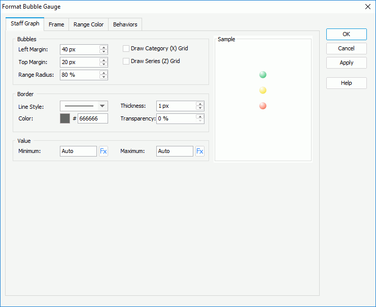
In the Bubbles box, set the left margin, top margin, relative radius of the bubbles, and whether or not to draw horizontal/vertical grids.
In the Border box, specify the line style, thickness, color and color transparency for borders of the bubbles.
In the Value box, specifies the minimum and maximum values to be displayed in the chart or use a formula to control the property. The values will be equally divided into three ranges, each of which will be filled with the color specified in the Color Range tab automatically.
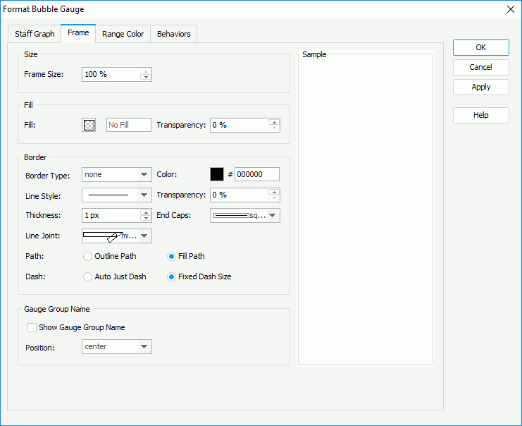
In the Size box, specify the size of the frame.
In the Fill box, specify the color and the transparency of the color to fill the frame.
In the Border box, specify the properties for borders of the frame, including the type, color, line style, transparency, thickness, ending style, line joint style, fill pattern and dash size.
In the Gauge Group Name box, specify whether to show names for the bubbles in the bubble gauge which are values of the field on its category axis, and the position of the names relative to the arcs. If the bubble gauge contains no category field, the group name shows Report by default.
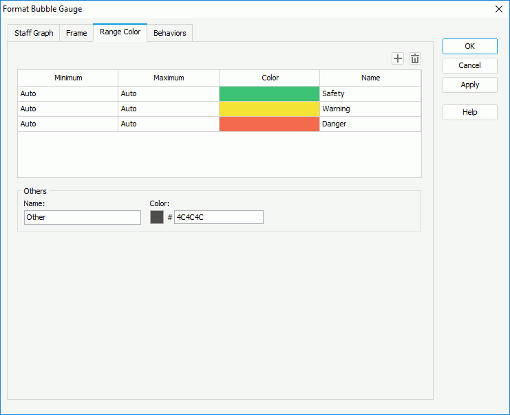
, and if a color range is not required, click to remove it. Then, in the Others box, specify the name and color for values that do not fall into any of the range you define.
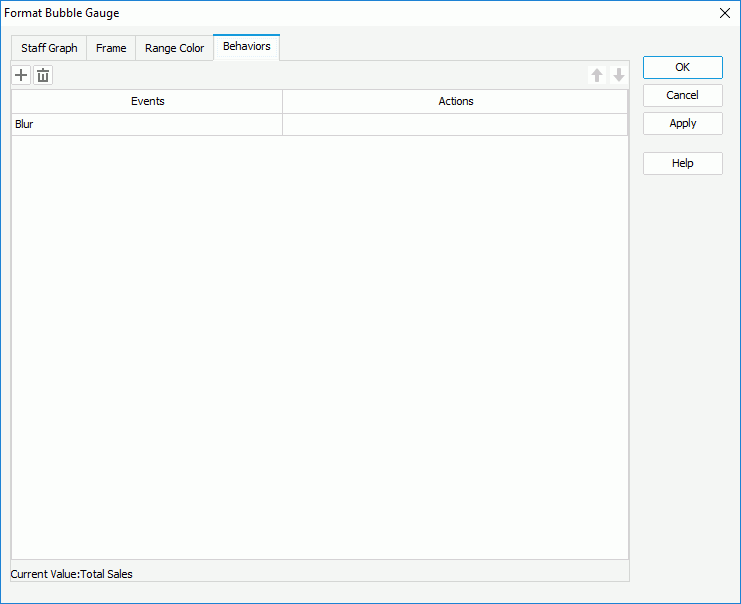
Select a trigger event from the drop-down list in the Events column, then click in the Actions column and click that appears in the text box. In the Web Action List dialog, bind a web action to the bubble gauge the same as you do to a label in the library component, which will be triggered when the specified event occurs on the bubbles. The web actions you can bind include Parameter, Filter, Sort, Change Property and Send Message.
To add more web behaviors, click and define them as required; if a web behavior is not required, select it and click . Click or to adjust the order of the behaviors, then at runtime when an event that has been bound with more than one action happens, the upper action will be triggered first.
When a solid, dial, activity, or bar gauge chart displays the gauge labels, pointer labels and target labels, you can format the labels accordingly.
The following takes the Format Pointer Label dialog as an example.
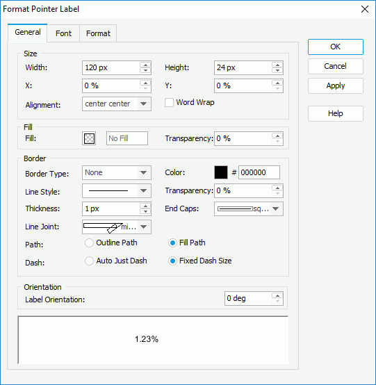
In the Size box, set the width and height of the labels, the horizontal and vertical coordinate of the top left corner of the object, relative to its parent container, the alignment of the label text, and whether to enable the word wrap function for the label text.
In the Fill box, specify the fill color and color transparency to fill the labels.
In the Border box, specify the properties for borders of the labels, including the type, color, line style, transparency, thickness, ending style, line joint style, fill pattern and dash size.
In the Orientation box, specify the angle of the labels so as to rotate them.
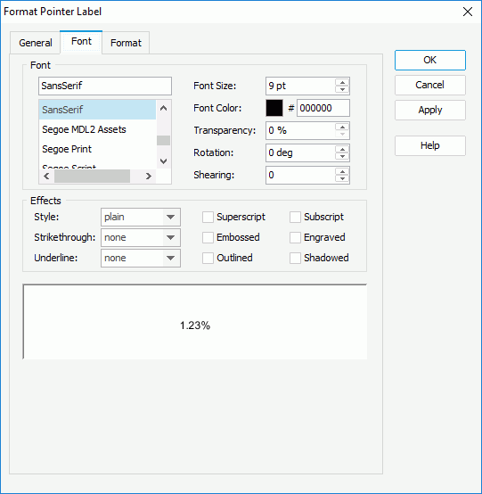
Select a category from the Category box, then select a format from the Format box and click Add to add it to the Stack box. If the formats listed in the Format box cannot meet your requirement, define the format in the Properties text box and click Add to add it as the format of the selected category. You can add more than one format, but for each category only one format can be added. In the event that a format is not necessary, select it in the Stack box click Remove to clear it.